Introduction
Due to the lack of exposure of the Interactive apps, there was a vision of creating something more engaging in order to satisfy this visibility. The idea was to surface relevant content to the user based on their account state and also based on the channel they are viewing at that point in time.
I approached this project differently from the My Messages project from the lessons that I learnt. I had history working with this developer squad now and was able to adapt and understand what form of documentation I would need as well as how to communicate with them.
The approach was taken by once again starting from a wire frame selection of ideas to then craft down to the core of what this ‘smart panel’ would be. From here, I used confluence as a tool to document the different states, logics, rules and pieces to give everyone the broad view of this project. This in turn was a useful and efficient way of creating a ‘specification’ that could be maintained very easily that would then accompany the visual design.
Benchmarking
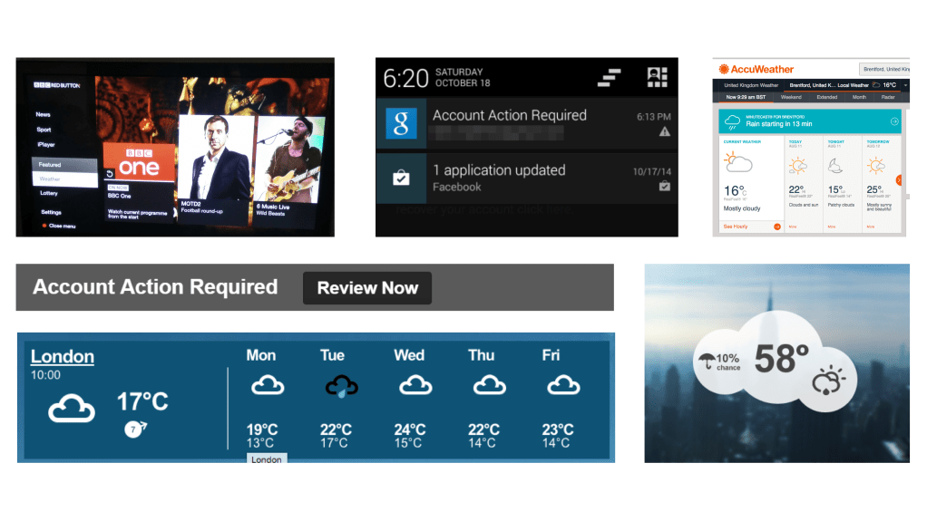
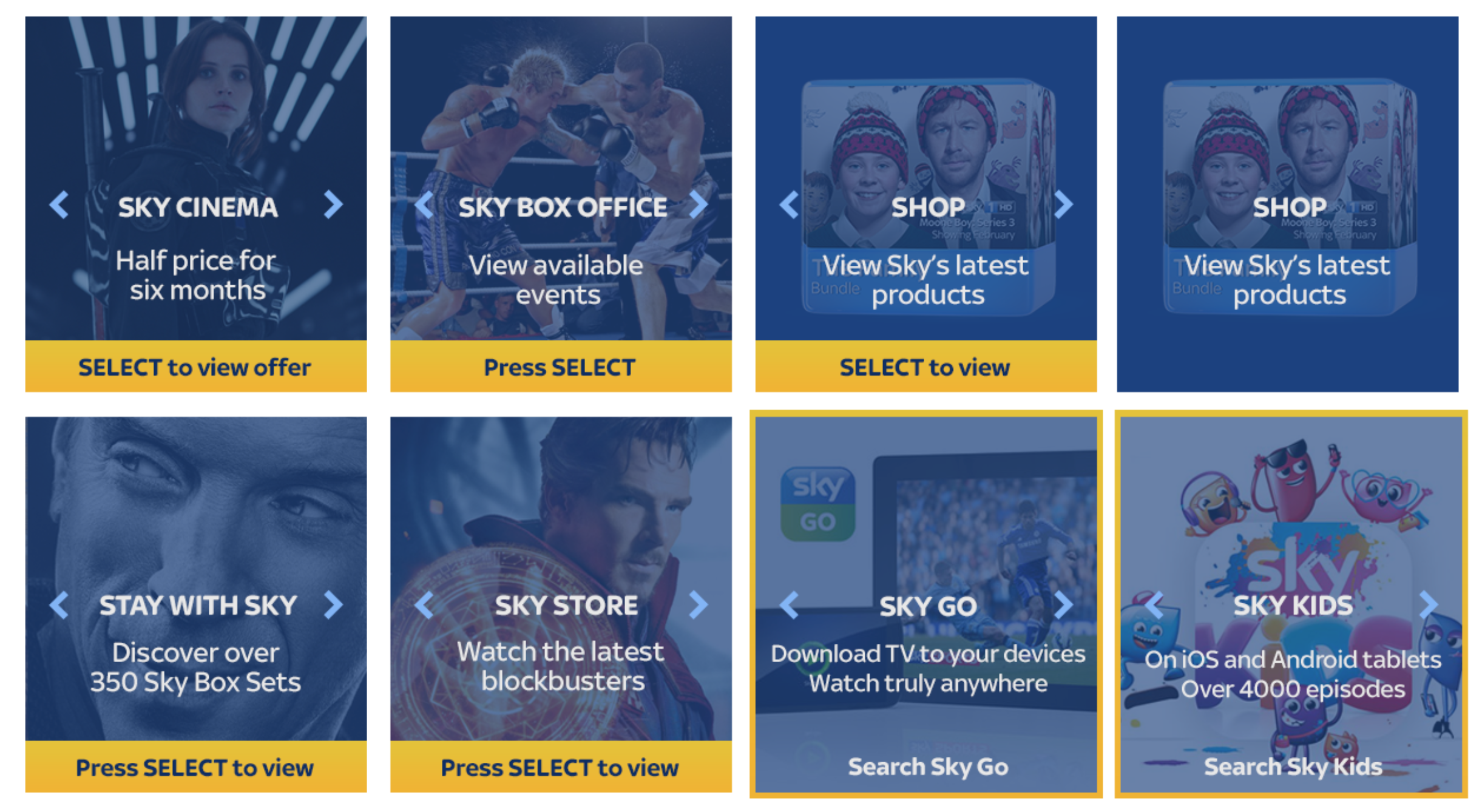
To begin the project I quickly looked at different dashboards, panels and widgets to start to get a broad view of what kind of information and ways of communicating it. This was then used to create mood boards and be used within the team workshops.
Opportunity
The opportunity was to compete with the BBCs red button ultimately. Sky wanted to offer an area of functionality and features that a user could engage with while enjoying their viewing experience.
The initial target was for the service journeys such as making a payment or getting help, but then to develop further into more ‘app’ based features.
As this function was nothing new we look a lean approach to come up with an MVP and also mapping out a vision of what would be required.
The behaviour was nothing new, overlay functionality had been around for years from the red button to Sky Qs new TV apps. This would be an opportunity for Sky to get better value out of their older technology.
Similar to My Messages, Smart Panel was created to get something live, to get the data, and then to perform user testing in order to get the qualitative feedback.
Team collaboration
Using the momentum I gained from the My Messages project, I worked with the same developers and project team again. Here I ran iterative workshops with everyone in order to map out the technical feasibility and journeys. As well a lot of ‘nice to haves’ and features were discussed and documented.
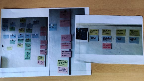
I parallel once again the back end developers got an idea early on on what would be created so could begin setting the foundations. Additionally the front end developers worked hard at home to get an overlay over the viewers content and options were discussed and workshopped.
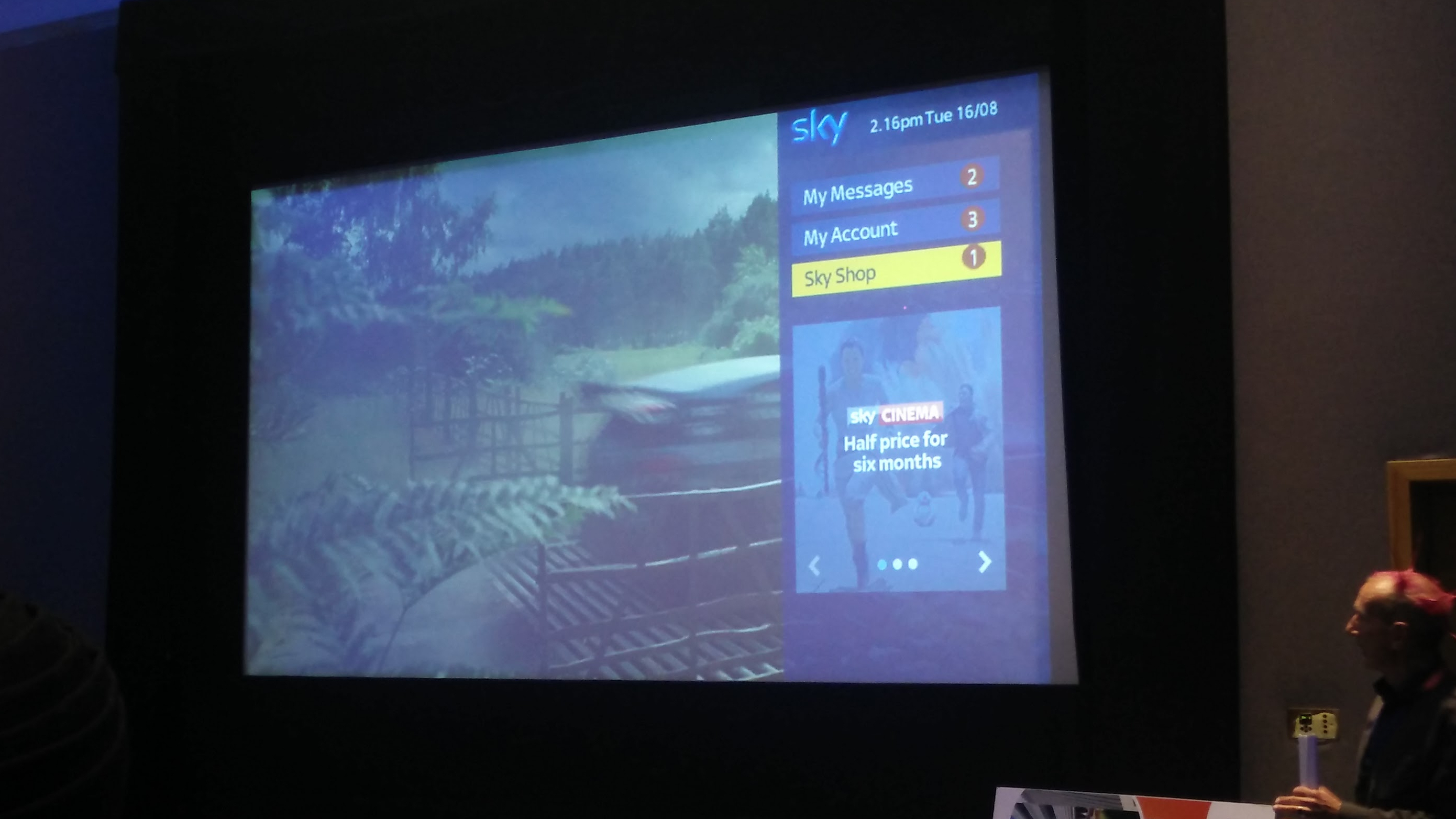
We would attend regular demos with the wider team to learn from each other. When initial designs were used on a working prototype, I was proud to see my work projected onto a cinema screen in front of the department.
Smart panel
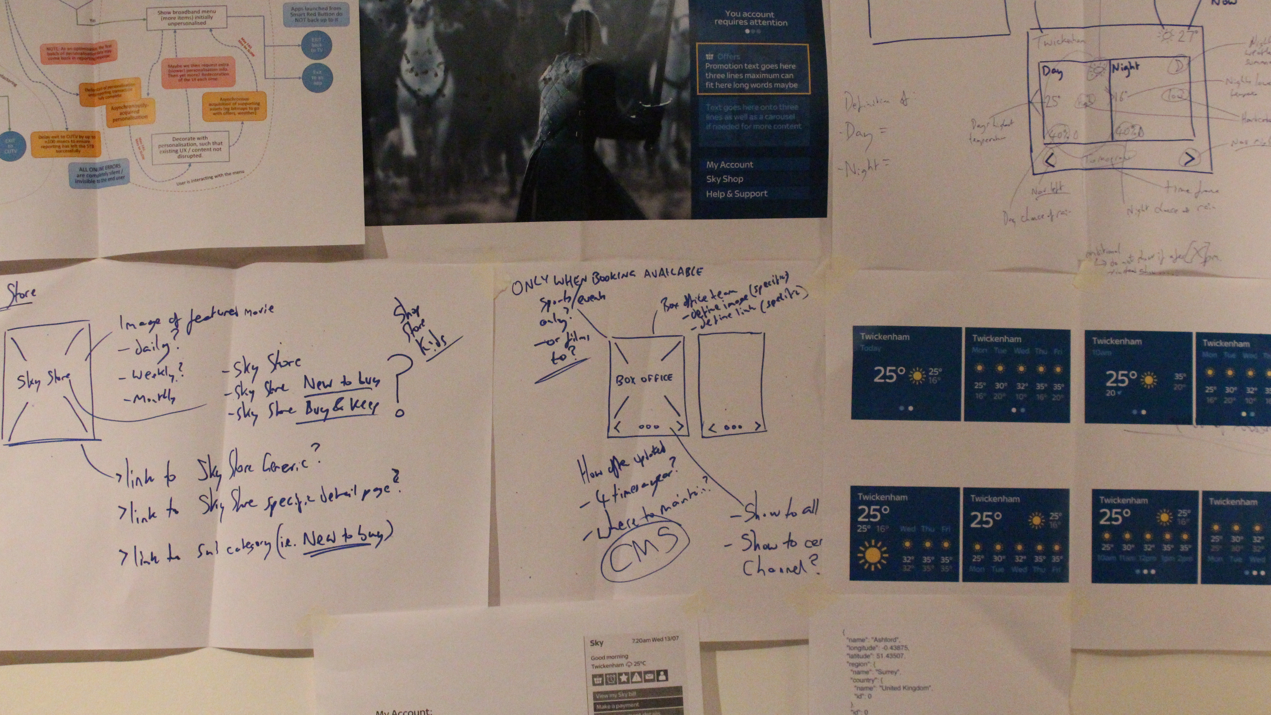
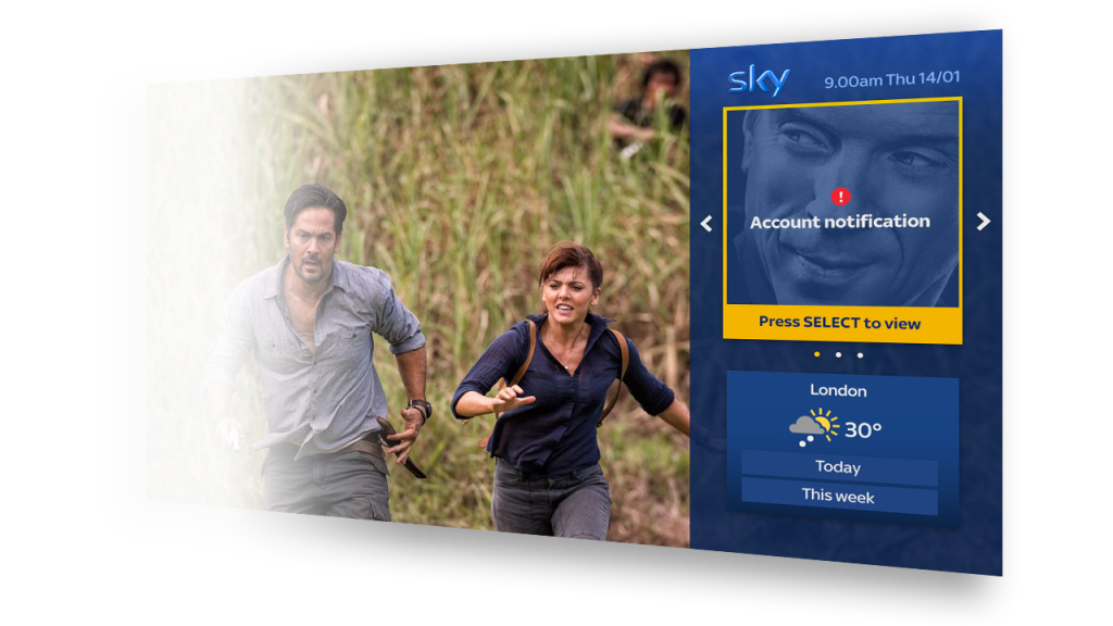
The MVP of smart panel had two main sections. Service announcements and weather forecast.
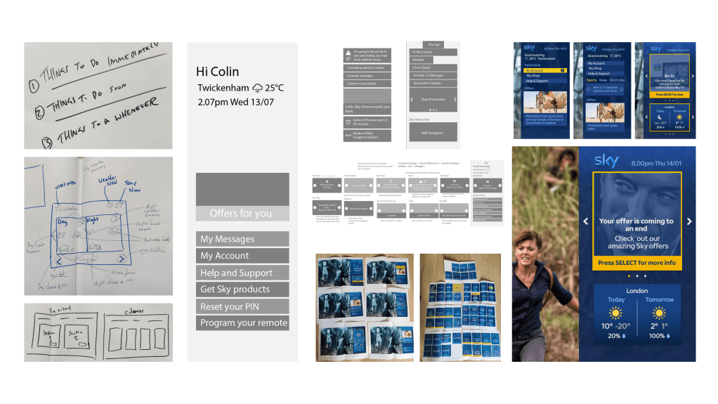
The weather forecast functionality was not necessarily a ‘must have’, however it provided interaction for the user that would be constant no what what service communications they had or did not have. It was my idea to add this as one of the initial areas of engagement. This was based on benchmarking of dashboards and panels, as well as a weather app existing on the Sky Q box. We spoke to those in the Sky Q team and were able to gain the api and assets in order to leverage and build our own on the Sky classic box.
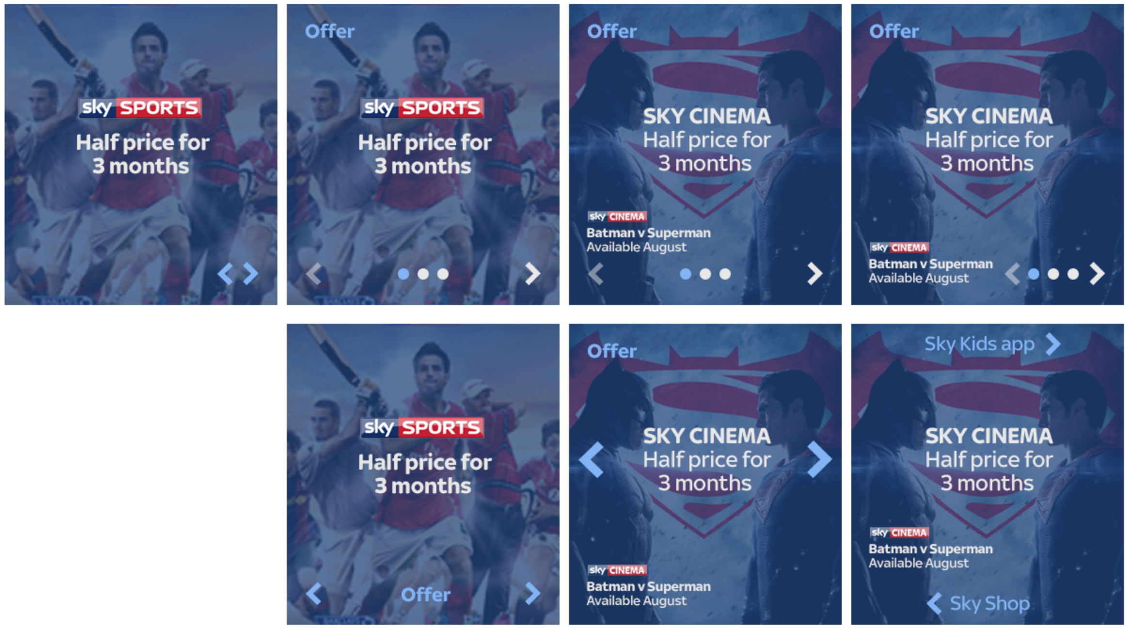
Panel cards
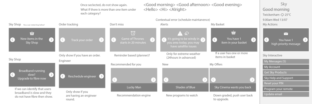
The vision for the cards were going from fairly basic content, to more contextual and user related content. These would have to align with the Sky design language, so many iterations were created and discussed with the Sky product design team to get guidance and steer on these.
Weather cards
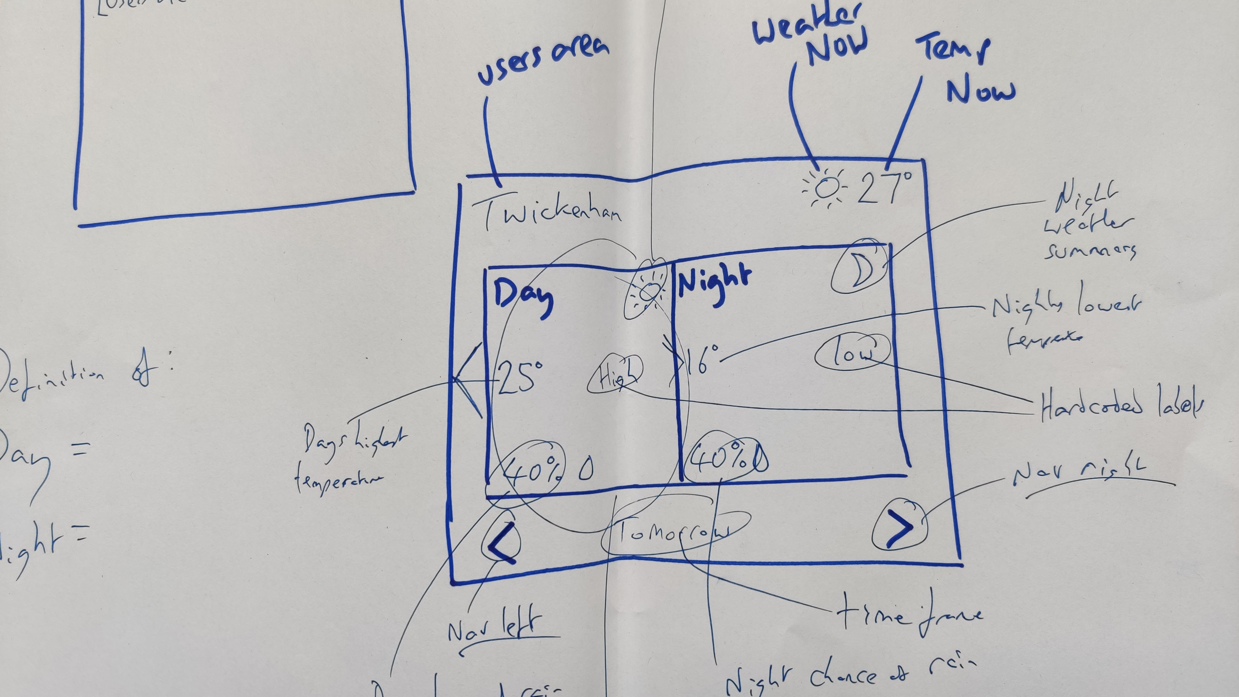
What do people need to know about the weather at a glance? This was the fundamental question for deciding on what to show. Going between trying to get everything into a small area as efficiently as possible to cutting back to the least amount of information.


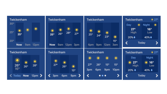
The final MVP solution would show your area and the current weather and temperature. This would then include two selections for todays weather and the upcoming week. It was decided to go with this approach and view as navigation was visible for users to understand what they can do with the weather functionality.
Future
I left Sky before the first release was delivered. However the plan was to expand and grow the functionality and have user research undertaken at Skys in house lab. I managed to see the first release live as I had Sky TV at the time. However I am unsure how future iterations developed. My view is that it should always help and serve the user and have some contextual. Seeing the development of the Sky Q apps, it was obvious that the Sky classic box was on its way out and Sky Q would set the scene for more advanced functionality that the business would further invest in.
Other Sky projects
