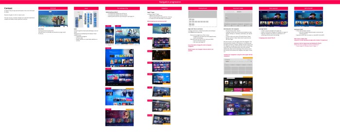
I worked on multiple Sky Go projects at my time at Sky.
1. Apple TV – creating a Apple TV version of Sky Go from the iOS buide
2. Sky Go strategy – working with a UI designer for the future of where Sky go could….go
3. Future – A passion project looking at “What might a streaming service be without rails?”
Apple TV
Introduction
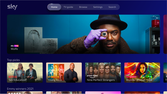
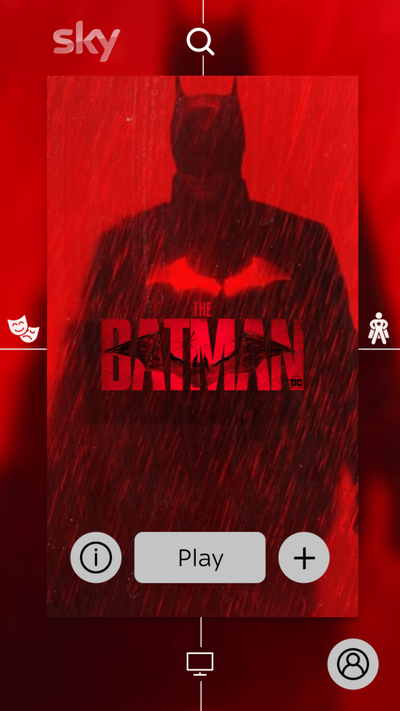
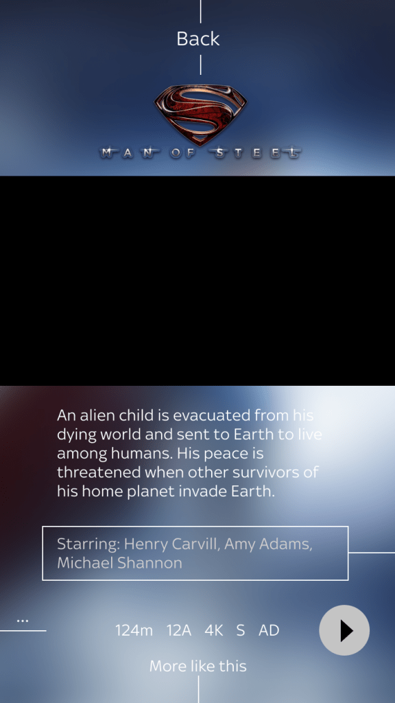
We will develop the Sky Go app for Apple TV in the UK. We will use the Sky Go iOS mobile codebase with the necessary adjustments in order to deliver big screen experience.
How does it work today?
Sky Go app is currently available on Apple TV in DE and it is based on the STB codebase. There is no Sky Go app on Apple TV in UK and IT.
Why now?
Having a Sky Go app on Apple TV is a pre-requisite for the commercial agreement to bring the Apple TV app to Sky Q and Llama. The existing codebase for the DE app is increasingly unviable for releasing new updates and will be replaced by the UK codebase. This will provide a better support for the DE platform.
Team
Amalia Sirignano (Lead UX)
Antony White (Senior UX)
Suzie Gurung (Junior UX)
Amy Hirrel (Lead UI)
Hayden Wilcox (Senior UI)
Christina Gajny (UX Researcher)
Using the IOS code base for touch devices to then ‘make it work’ on TV. Product saw this as a lift and shift project, but instead throughout realised there was more work required in order to make it work.

Dev driven
Starting point was a build of IOS.
German build is on the QMS and would be too big to build for Sky Go.
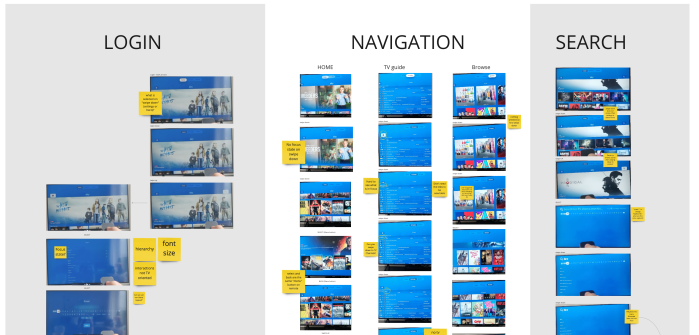
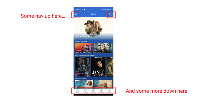
Audit – Issues
Going through the initial build identifying UI and UX issues.
Varying from housekeeping and tidying to major usability issues:
- Mobile interface on screen (bad usability on a remote)
- Fragmented navigation
- No focus state

Exploring Skys products
- Inconsistencies between Sky and Sky Go
- Inconsistencies between Sky Go products
- Exploring what direction we should go for with Apple TV
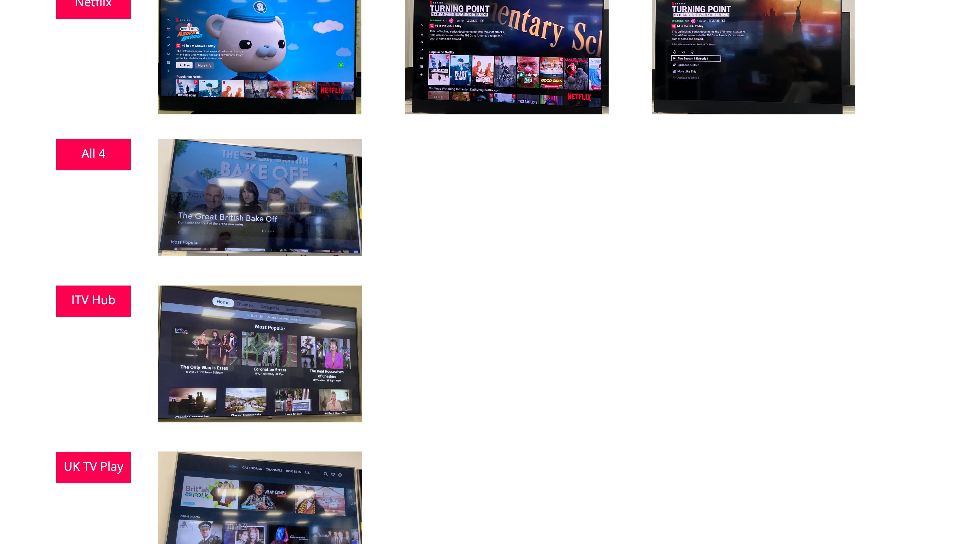
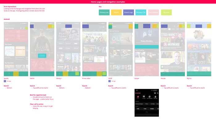
Competitors – Apple TV apps
Looking at Apple TV apps
- Majority use horizontal nav
- Most use Apple Native component the ‘ Tab nav’
- A couple use a left side drawer more bespoke
What should we do to be future proof?
Align with Tiles UI and future
Looking at the future, of what Sky would be and looking at how Tiles UI was progressing.
- Remove the navigation (as Tiles UI does)
- Integrate the nav within the Home page (browse, search and settings)
- We know Q will use Tiles UI from next year (2022)
- Focus on the future vision
- Pilot vision with Apple TV
Issue: Not able to change the rails to integrate navigation
Would require core changes to Sky Go which is not possible.
Slimming down the navigation
- Placing ‘Browse’ within ‘Search’
- Creating a ‘profile’ area to future proof additional areas besides ‘Settings’ i.e. hardware, downloads, user specific items
- To then trickle to the other IOS builds (Phone, Tablet)
- Remote control is ‘linear’ where touch screen the user lifts their finger
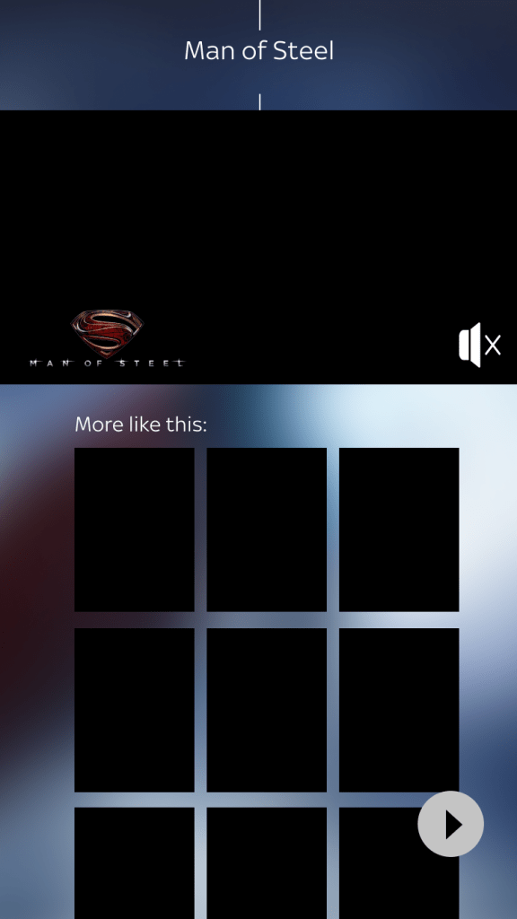
We have chosen to use the apple native ‘tab navigation’. The build presented is based on IOS devices so consistency was the logical conclusion. However, ideally if we were to get rid of the navigation and align with tile OS, then search and settings would then have to be placed within the home interface. Additionally, Glass has the advantage of the remote control with certain functionalities and navigation that Apple TV does not.

Leverage Native
- Unable to add and change home page rails
- Impact on IOS build if changes are ‘bespoke’ for Apple TV
- Keep the navigation the same but ‘optimised’ to TV – combining nav and search and settings
A stepping stone toward Tiles UI (aligned with Sky Glass)
Estimates of MVP
- 4 hour dev estimation session
- Still more changes required based on what we had slimmed down to
- Explored an MVP then cut down to a ‘tidy’ (MVP of the MVP)
Short term is ‘deliver fast’
Long term ‘Further develop and align with a holistic TV experience’
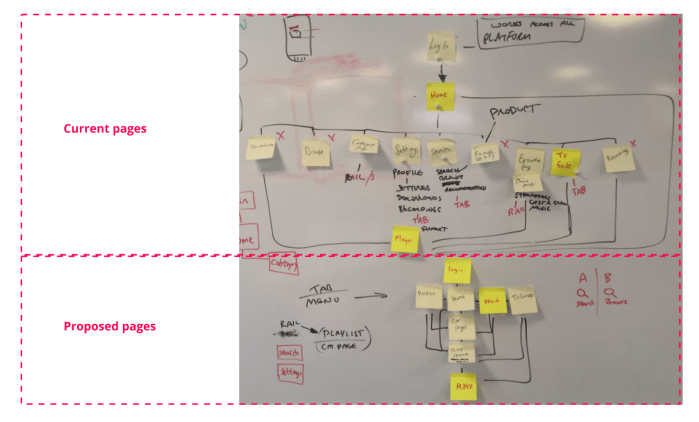
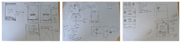
Navigation workshops
The biggest challenge for the Sky Go on Apple TV work was the navigation. Through the conversations about what we should go with, it was clear in the end from leadership that using the Apple ‘Tab nav’ pattern was not going to happen. The main reasoning was leadership had battled for there to be no nav on Sky Glass, and bringing one in now would not be consistent and would draw unnecessary attention to why would go with a navigation for Apple TV.
Due to this we hosted a series of workshops to go through potential options based upon the existing Sky Go paradigms, as well as Sky Glass.
The options that were narrowed down to were:
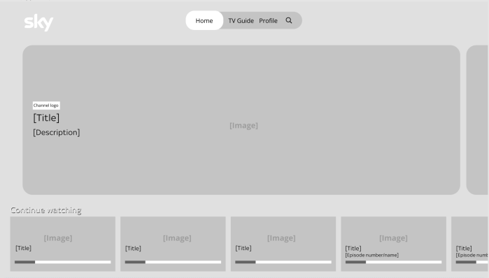
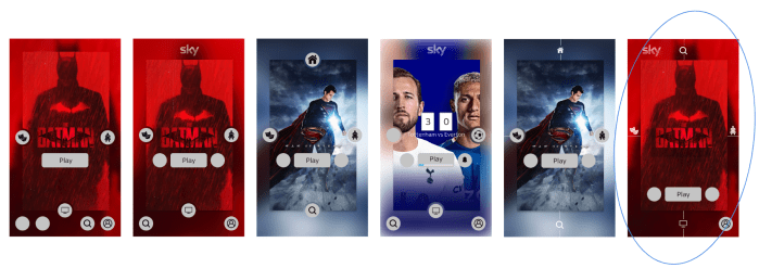
1. Big Step to Tiles UI
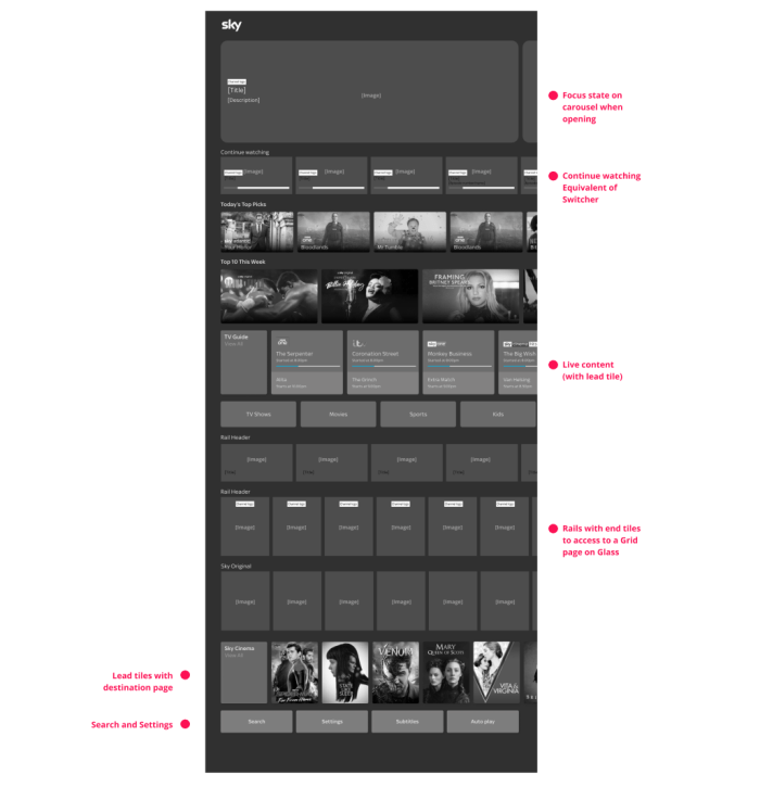
Reasons to do it:
- Aligns with Glass (consistent)
- All items are integrated into home
- TV guide is visible and has quick access to live content
- Ability to make certain areas of settings visible i.e. Subtitles as a navigation item
Things to consider:
- Focus state isn’t clear when page is loaded (depending on carousel style)
- Hero or promo carousel instead of focus area (i.e content description)
- Continue watching rail used instead of switcher and playlist
- Search hidden all the way at the bottom
- Content different between Go and Glass
- Genres and browse categories are different between Go and Glass
- Lead tiles can’t be applied to everything due to rails being different from Glass i.e. catchup
- End tiles – differences between the two (goes to grid)
- Remote control on Apple TV has fewer buttons compared to Glass
- i.e. No Home button on remote
- Apple customers vs Sky Go customers – navigation mindsets
- Additional effort for dev
- Merchandising complication – apple tv and mobile/ tablet difference
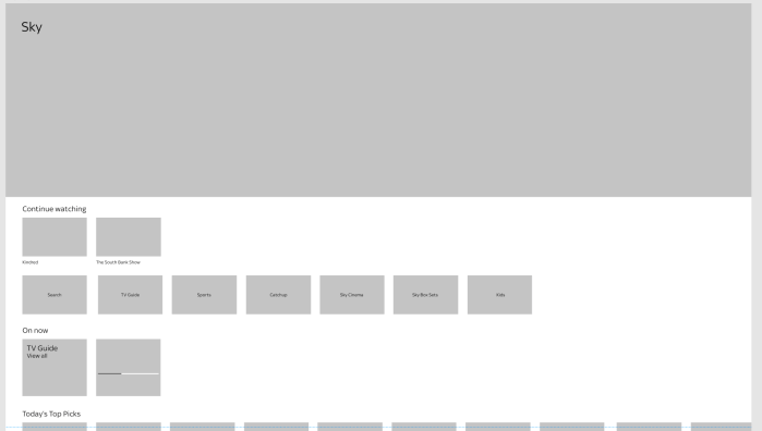
2. Rail Same Nav
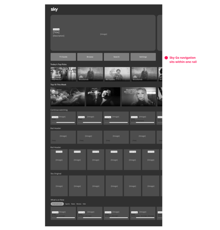
Reasons to do it
- One rail required to build
- Least impact on the Sky Go build
- Search and TV guide are visible
Things to consider
- Initial focus is on promo carousel
- A mixture of different navigation points
- Navigating to other areas requires the user to go back to home
- Navigating to here when within the journey will require the user to push ‘back’ many times
- Content is moved further down the page
3. Search & expanded Browse Rail + Rail settings
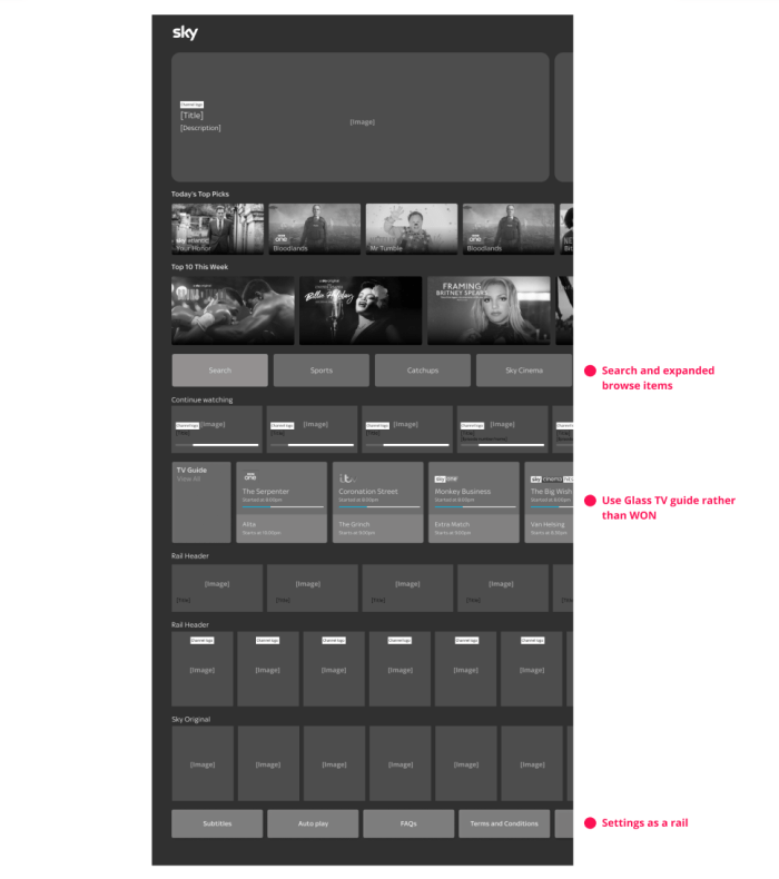
Reasons to do it
- Search and browse items are appropriately grouped
- Browse items are exposed
- Settings as a rail – items visible
- WON to become TV guide rail
Things to consider
- Settings hidden at bottom of page
- TV guide pushes other content below
- Less WON content visible
Workshop brief
Our vision for the future of Sky Go is to align with Tiles UI:
What can we achieve for MVP?
The activity was to use a variety of components to the different page concepts and come up with our own visions within the team. There we re 6 of us coming up with concepts within design, product and technology representatives
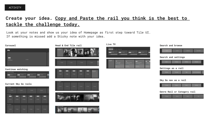
We then voted on the best concept. This concept aligned to the second idea. We then created actions in order to progress from our various disciplines.
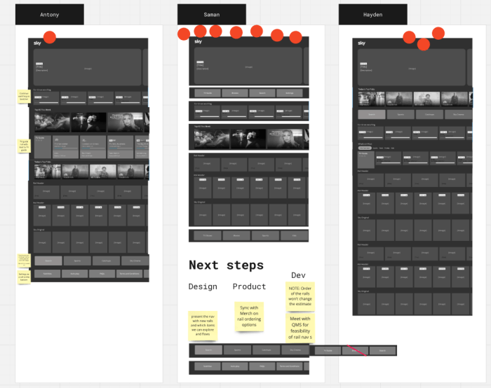
Once the home page had been progressed the Apple TV initial designs could be finished and handed over to dev.
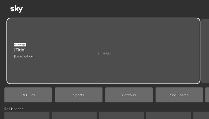
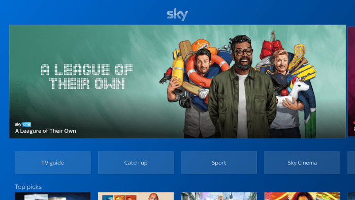
All the findings and pain points of the iOS build were address through our specifications.

As well as delivering the specification for the whole of the Sky Go Apple TV build, I provided voice guidance scripts. The process was going through the existing build piece by piece and listening to how it would sound. Taking this and working out the issues, as well as collaborating with the accessibility team.
The Apple TV project provided a rapid way of using the iOS build in order to get the app live on Apple TV. This would be one of the pieces that would feed into the future plan. At this point we had detailed specifications and UI of the entire Apple TV app, which would then influence and align with the Sky Go future plan.
Sky Go – Future plan
Team
Antony White (Senior UX)
Hayden Wilcox (Senior UI)
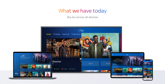
There is significant opportunity to improve collaboration and connectivity between Sky Go and the core Sky products, whilst improving the UX & UI and reach of Sky Go.
Discovery
We started our Discovery phase to define a Design Strategy for Sky Go.
Collaboration
Collaborative session with all disciplines and stakeholders to analyse Big screens, mobile and desktop experience and empathise with costumers needs
Usability Audit
We identified usability issues and created a list of opportunities following Usability Heuristics by Jakob Nielsen
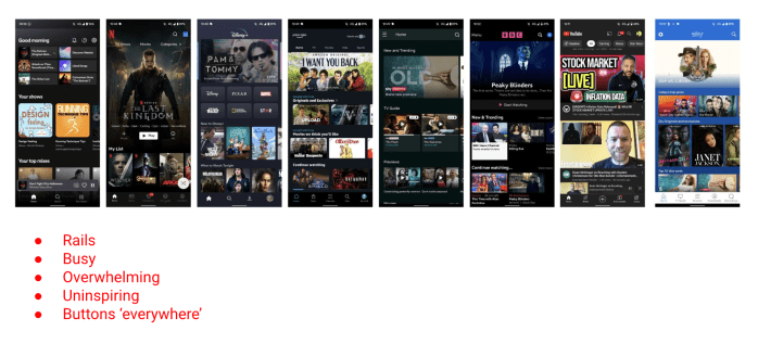
Benchmarking
We did a benchmarking exercise with our competitors to understand the market, approaches & trends
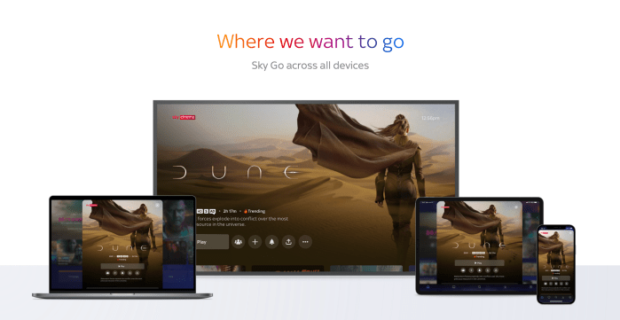
The Vision
Aligning Sky Go into the Sky Design ecosystem so we speak to users in one holistic voice
The Plan
Leverage Tiles UI (UI framework) and Future 24 (hackathon sessions)
- Basic – A simple update of the UI – colour changes, curved edges etc. No change to accessibility, or UX architecture
- Our Aim – Update the UI to match Tiles UI and where Tiles UI is heading. Update the UX architecture, creating a more future proof adaptable foundation.
- 5 year Plan – An immense overhaul of UI and UX architecture, aligned to Anthony’s vision, thinking far into the future of what Sky could be.
Our Approach
- Tiles UI – We will use Tiles UI as a base framework across everything. Merging it with native functionality where appropriate.
- Foundations – We will create the foundations for each device in Figma, enabling the work to easily be adopted by any designer.
- Future 24 – We will take the learnings and work from Future 24 and map them out across all the devices, pushing that 1 voice to the user.
- Alignment – We will create designs for a back end alignment so no matter where the user is watching or interacting with our content they can pause and continue on any device.
Outcome
Be maintainable and scalable
- Holistic – The creation of a consistent design language across all sky products that works along side each other and speak to users as 1 brand.
- Libraries – The creation of libraries and templates in Figma for each device on ‘Sky Go’ that is aligned with the rest of Tiles UI.
- Future ready – With squads on the horizon. Everything would be made easier for anyone picking up the work (Sky, NOW, Comcast) as it would all be in one place.
- Accessibility – Accessibility will be at the heart of our designs, having more than just text to speech, enabling a far wider array of users to enjoy our content.
The Design Roadmap
The idea would be we kick off and creating the foundation and ways of working through the home page, global navigation and various core parts. We would then empower and give crews and squads to be able to work on the additional areas.
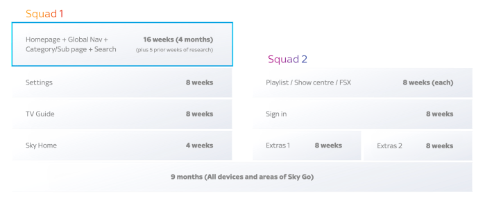
Sprints & Epics
Creating consistency across all Sky devices within 9 months.

We road showed our strategy and vision of where Sky Go should go. This would in turn influence the plan for tackling Sky Go holistically, but within the global world of Comcast. We did not continue working on this piece due to a restructure of teams, however before we handed over we managed to get a piece of research completed.
Sky Go concept
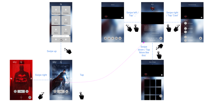
What would be bold for Sky Go to do?
Looking at mobile as a starting point.
What makes a ‘better’ browsing experience?
What would a streaming service without rails be like?…
Approach
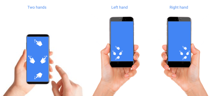
Ergonomics
Actions all in reach
Personal – likelihood
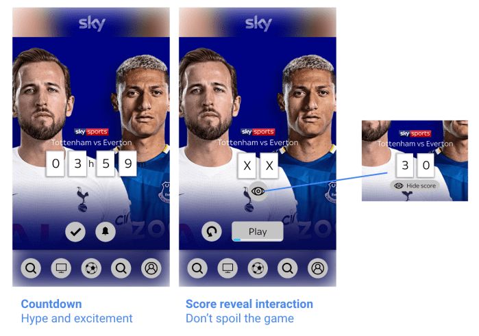
What would the user most likely want now?
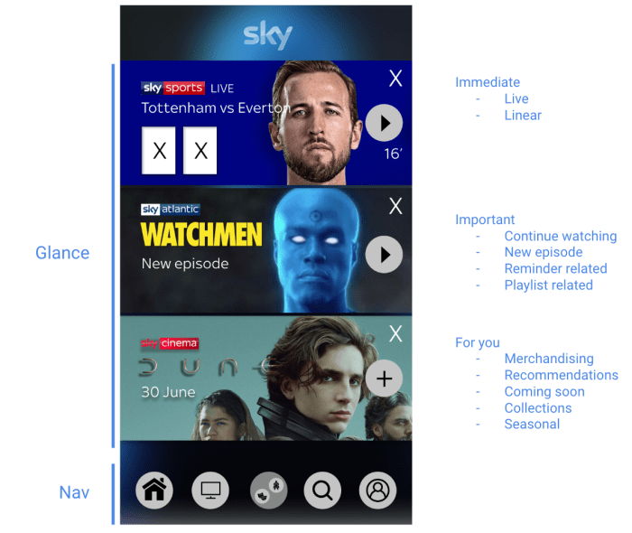
Focus
Being more focused than ‘frantic merchandising’
Sketch
Exploring layout
- Content rich
- One thing at a time
- Focus on whats relevant right now
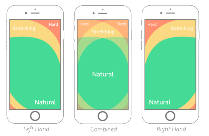
Designing for thumb zone: https://www.smashingmagazine.com/2016/09/the-thumb-zone-designing-for-mobile-users/
Flexible gestures – no need to stretch
Focus on home and Landing
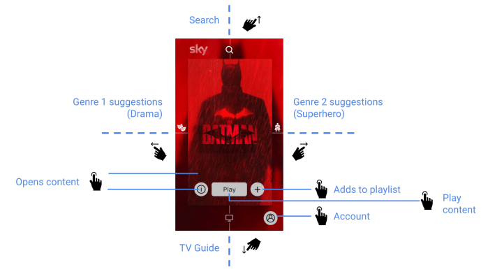
Grid swipe navigation
All about YOU
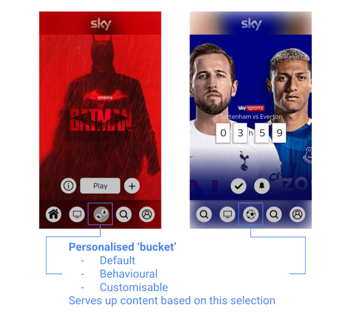
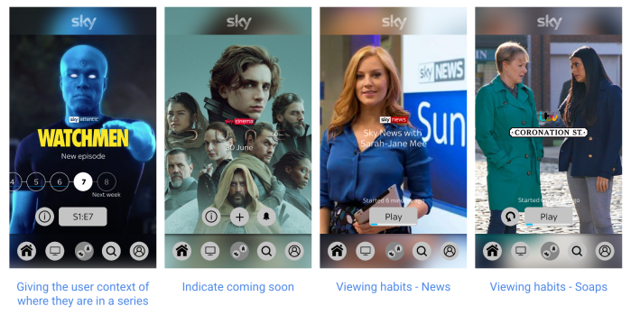
At a glance…
Sport
Scalable for all genres


Next steps
- Need depth and detail
- Rationale of choice shown
- Mechanics stress test
- Large screens adaptation
