Team
Antony White (UX – Discovery)
Hayden Wilcox (UI – Discovery)
Angie Heisel (UX – Commerce)
Lizzie Rayner (UI – Commerce)
Lucy Cowley (UX Copywriter)
Chiara Miele (UX Researcher)
Time
4 months
Introduction
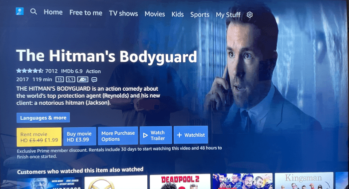
Sky Store content was contained within an app. The brief was to integrate the Store content into the rest of the Entertainment OS experience. Entertainment OS is the software for the global solution, Sky being one of those ‘flavours’.
This capability is needed for Sky UK, Italia and our syndication partners, to allow customers in these markets to buy and rent TVOD content using the Ent OS platform.
The brief was simple enough, however there were many technical constraints and nuances for different territories that were discovered during the process of the project.
The challenge from working on the Discovery (crew) side was the show page redesign was ongoing that I was additionally working on. The challenge was the timelines for both projects, about how they would impact one and other.
Discover
When working on a piece that fits into a bigger picture product, the first thing is to get a lay of the land and understand where there may be impact to the wider experience.
My first point of call was looking at the existing store app and the way in which content is currently aggregated. My main goal was to make sure that the store content would sit within the current Show pages, rather than creating additional pages for store based content i.e. Store app and Sky Q. There was a lot of push from the business to make it like ‘Sky Q’ (Skys flagship product). The issue was about duplication and not integration.
The starting point was to plot out the various stages of purchase, that being browsing, purchasing and fulfilment. Taking these high levels, we as a team could then plot out what different requirements, components and areas of the experience would be impacted. These would be assumption and expertise based, but gave us a strong breadth of visibility of impact.
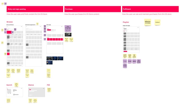
With the initial straw-man, the main result would be for each discipline and area to either raise or answer questions. This was a great way of rapidly getting through a lot of assumptions and understanding of the project to then align, and create actions for the various areas.
Taking the feedback, I then progressed to create a broader straw-man to cover most of the points raised.
Collaborative Straw-man
The Straw-man was also used as an exercise to look across the entire Entertainment OS experience and highlight the different areas to the different disciplines. This would then demonstrate the impact across the system as to what would be required in order to support Store content.
The collaborative Straw-man is one of the main parts of my process to collaborate early with all stakeholders and disciplines in order to begin to create a shared vision as well as get into a lot of breadth and depth of what the project will entail.
Data
In parallel to mapping out where the solution would impact the current experience, We had some data to help guide the design. The main data was around when users who ‘download’ store content then watch it. The vast majority being straight after downloading content (on Sky Q). This would really help strengthen the rationale of the purchase and watch journey.
- 90% of assets downloaded in Sky Store are eventually watched
- Of these Store assets which are watched, c.80% are watched on the same day and c.70% are watched immediately after downloading (< 1 hour) equating to 62% of all assets downloaded in Sky Store
- Worth noting that this includes all Store transactions so rentals + purchases
- This means that 79% of Q customers download and watch on the day they selected the movie. From these customers, 86% watch straight away and 5% after the 1st hours, 3 after the 2nd hour etc.
Competitor analysis
The main objective of the benchmarking was to look at how store content across competitors and comparators handled the IA of information i.e do they show all options up front? Are there specific ones they try and sell? How do they visually communicate a purchase.
We looked at Prime video, Youtube, Apple TV, Google Play, Sky Q and the current Sky Store app.
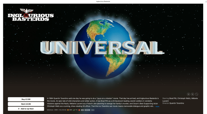
To begin with we were looking at the difference between Renting and Buying, and understanding how other solutions catered for a multitude of different combinations, looking at TV as well as film. As we progressed through the project, the scope started to narrow down, but we designed at scale either way in order to understand how the store content would grow in the future.
Define
Throughout the project I mostly lead the sessions when aligning and stitching my area of work to other areas. These discussions, workshops and little and often conversations and walkthroughs were the main crux of making sure we were covering everything required to support the work.
Now that a straw-man had been worked on by the majority of the team, it was time to stress test and flesh out how the solution could begin to shape. Having UX and UI at the start was great for us to ‘divide and conquer’. For example, us UX designers could begin to create the user journeys, IA and stress test different content types, while UI began to experiment with layouts, animations and consistency.

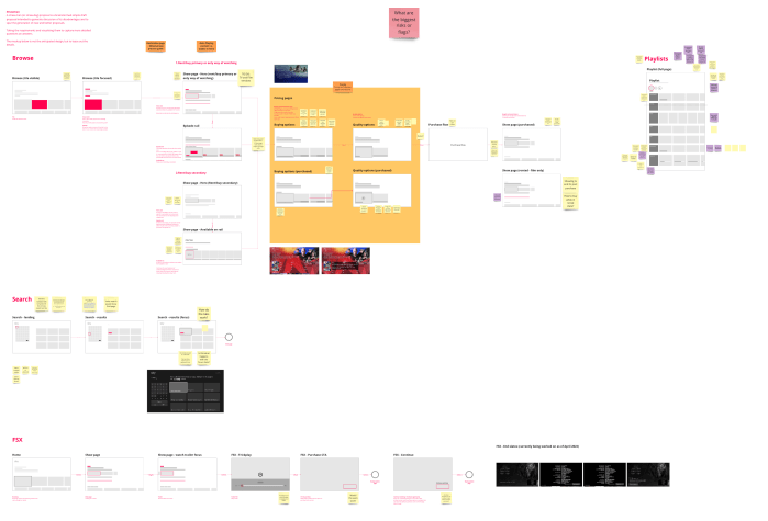
V0.1
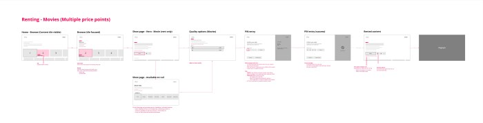
Version 0.1 was the next step after the Straw-man. I would work with the team to develop the journeys further into more detail. I explored through here the different parts of the store such as movies and TV shows and the impact to the various parts of the show page. At this point I started to look at having a ‘quick purchase’ button, that being having one CTA that would be the most likely form the user would want to purchase in, rather than presenting a big list straight away. This was based on benchmarking as well as user data suggesting there was a clearer purchase type, as well as aiming to have this conditional to the user i.e. serve UHD if the user has UHD.
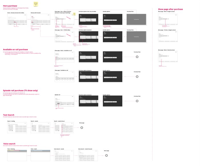
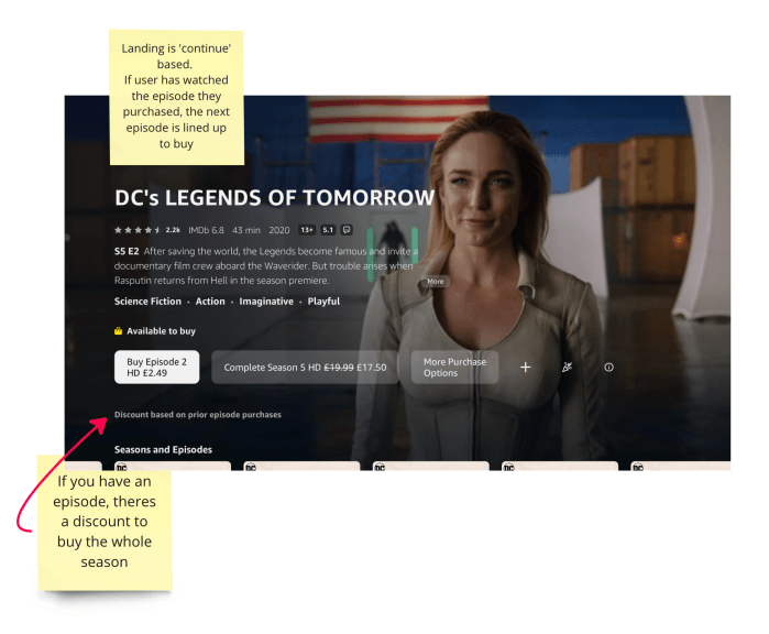
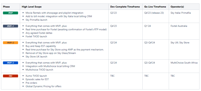
Through the Define phase we questioned and started to narrow down the specifics of the brief. The ‘MVP’ was slowly being fed in from stakeholders about the phased approach. Phase one would be for just the Italian market. This would only support renting movies. Due to this we were able to focus on the MVP, but in parallel still work on the holistic solution including rental and TV shows.
Develop
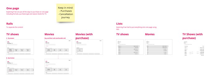
The flows and designs would then go into the Develop phase. When coming to feedback, our view was to have a multistep flow in order to adhere to progressive disclosure. Some stakeholders felt that adding more pages would effect conversion. We looked at both a ‘one pager’ vs multiple steps. In summary, the conclusion was that a one page solution would not be scalable to accommodate all the different combinations of content type, quality and other factors. If say, there was only one quality type, then there would be no need for an additional step, making that page conditional. This is something we had from the very beginning. A lesson learnt was to even map out the not so ideal experience in order for stake holders to understand where the idea may not be suitable.
We used MIRO to map out four versions while to use to walkthrough with product, tech and other stakeholders. These iterations would lead up to the point where we would need to test and validate our ideas.
The imagery below looks at the differences of the Show page (which existed while this project was ongoing). The redesign was to move the structure around in order to let the imagery communicate the content.
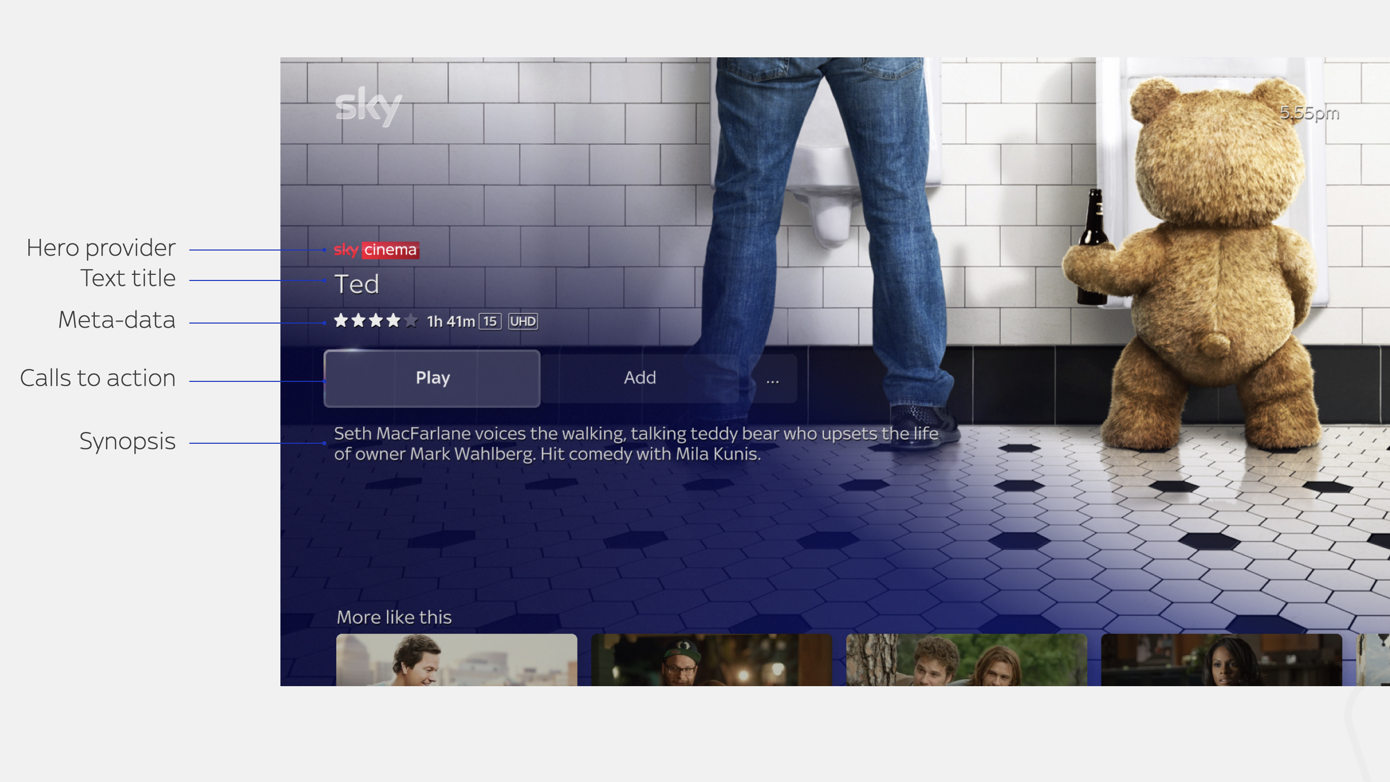
As the redesign was ongoing in parallel, we worked at what store content would need to do in order to work on the new solution. In essence we only needed to focus on the CTAs, to indicate that content is to be rented, as well as meta data for a purchased state due to legal requirements of purchased states such as viewed or not viewed. These would be added into the prototype for testing.

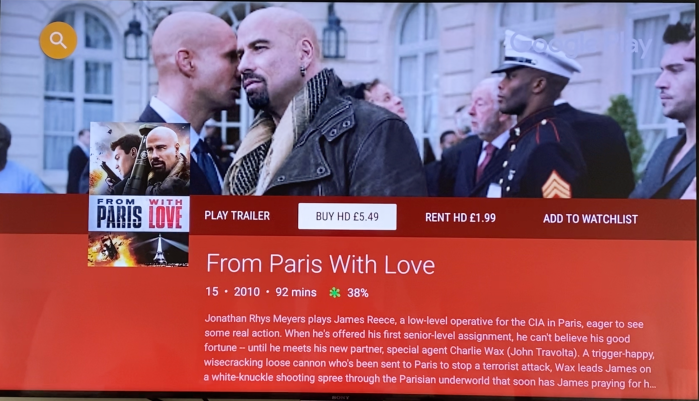
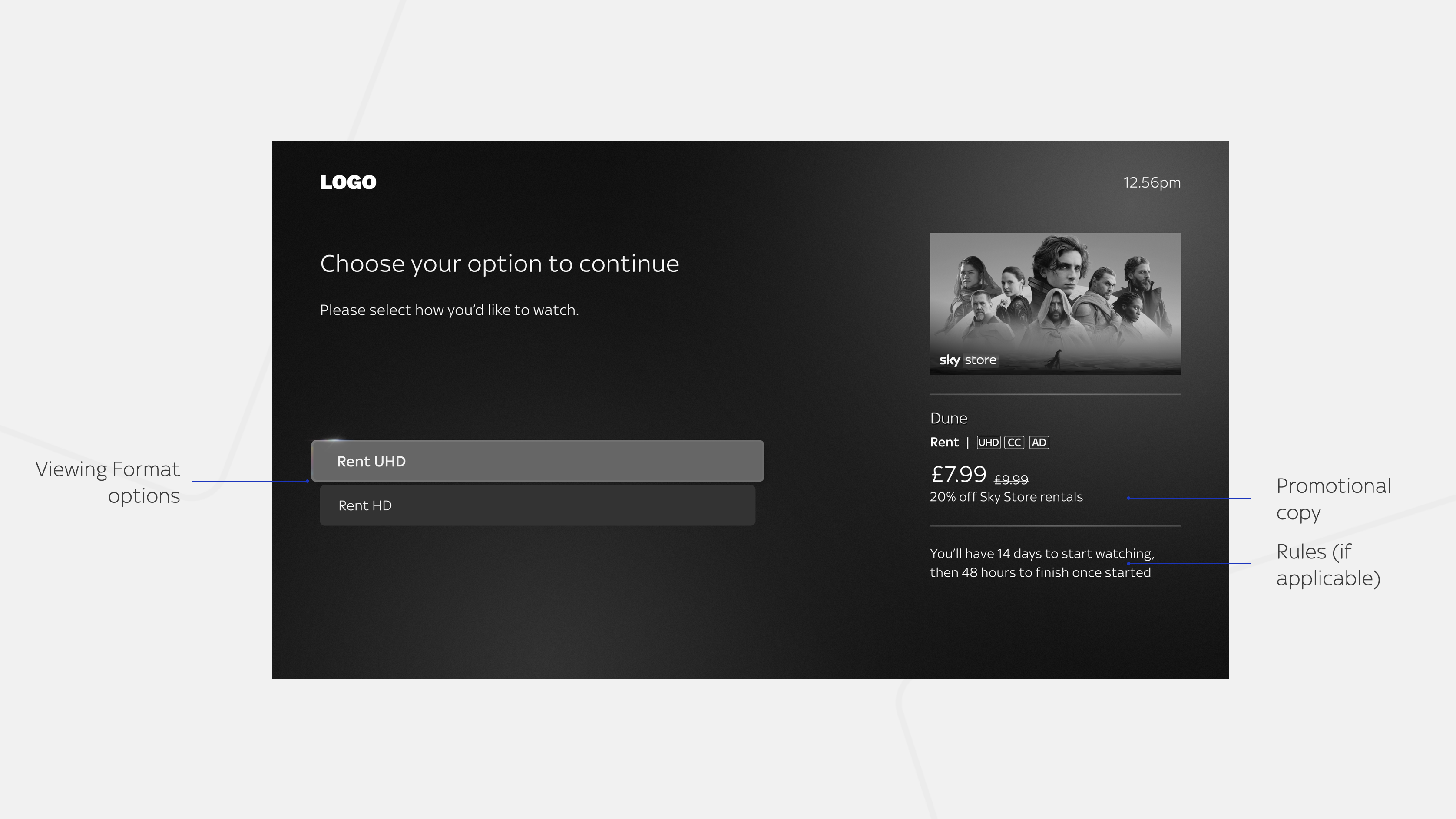
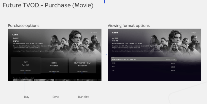
The Viewing Format Options page would be a page we needed to get feedback on as this was a very new page type that had been tested before, but not in this context and was also not currently live. Here we were to look at how the metadata communicated, if it was enough, as well as where the user would look throughout choosing.
We prepared prototypes for the testing. When working in TV and doing remote testing, we had to create an emulator of the TV experience, as remote unmoderated testing would not allow the user to use a real remote control.
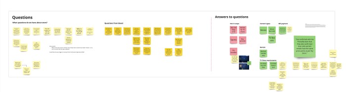
Research
Working with a researcher we wanted to test out our concept. We tested unmoderated through UserZoom with 25 users, a mix of Sky and Non Sky customers.
Discovery research objectives:
- Understand how people choose to purchase (price, or buy/rent, or format option first? how is pricing influencing decision making on show page level?)
- Understand what CTAs may be needed from checkout (confirm button with PIN, forgotten PIN, T&Cs)
- Uncover any pain points
Validation research objectives:
- Validate the end-to-end experience for MVP (add to bill model, for Sky Italy) from choosing a product to watching
- Measure understanding of the product purchased and clarity of payment
- Define whether buy and rent options are on one screen or separate
- Define how we show format options to users (should it vary depending on TV setup?)
Findings
- Overall, the rental journey was easy, intuitive and straightforward to complete for all participants
- Half of the participants felt that some information was missing on the show page
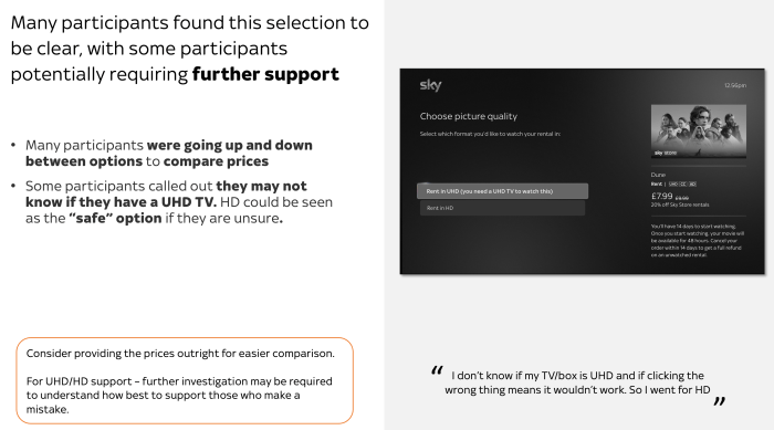
- Many participants found the UHD/HD selection to be clear, with some participants potentially requiring further support
- Rental timelines were not noticed and recalled by many, but this could be aresult of the testing and task
- Many participants were fine with providing a TV PIN, particularly parents
Key insights
- Some participants called out the need for a confirm button once the PIN is entered for further validation/acknowledgement of the intent
- The majority of participants found “watch by 15 July” to be most helpful
- Overall, the in product cancel journey was really appreciated by many of the participants, calling out how easy it was to cancel
- “Purchases” may be misinterpreted to mean all purchases
Deliver
Changes made from testing feedback
Overall the testing went pretty well. One of the main areas that was always up for debate was the Viewing Format Options page. The reason this was a challenge was due to where the Discovery and Commerce crews overlapped. There was a lot of exploration and debate around how this page would go. The Commerce crew had done some work on having a right had column as a ‘growing receipt’. Though it wasn’t in production there was a push to pilot it with this piece of work. The version that was tested was the more slimmed down version to see if there would be enough information for the user. However, there was a feeling that this wouldn’t be the best use of it, and testing help to steer this.
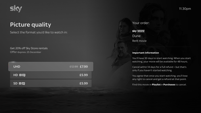
The changes were to put the price and details within the focused format option. This would mean that the right column would be reassurance of the content with all legal rules being contained. This meant that the users gaze would be contained on the rows compared to having to look over to the right column. By removing pricing and details from the right column, this meant there was no duplication of information. Additionally, having the pricing in the rows, the user could visually see a comparison of the different prices.
Details about if the format was supported was also removed due to this questioning to the user if they had a compatible TV. This was taken out as there would be an intercept on selection in order to guide the user. We know some users could buy on one device and stream on another, i.e. buy UHD on a HD TV, but watch from a UHD later.
Sitemap
The sitemap was the main way of fitting all the pieces together without having to maintain many detailed screens. My aim within the delivery phase was to get the sitemap sorted and signed off first in order to keep up the pace and lower the amount of screens that needed to maintained. This proved a crucial part of the signing off process with product and stakeholders, and it meant we had a one page snapshot that included page level based rules and where in the journey the user could navigate to.
User journeys
Throughout the process when we moved from MIRO to Figma, the user journeys were the way of showing the exact flows when presenting and collaborating. My view on getting into Figma too early is the issue with maintenance as multiple flows will have some of the same screens. The delivery of the journeys would be to visualise the sitemap better, but for tech to not rely heavily on the detail, as the specification would contain this.
Specs and Voice guidance
The specs is the area in which all the different rules and details are illustrated on a page template level. This simplifies the deliver of what is required to be built, and suits the way in which developers take the solution piece by piece.
With the specification, voice guidance is included which in some cases was simple enough to do as some templates already had voice guidance, where as others would require more attention. For new templates, working with the accessibility team to get support was very useful and kept the structure consistent with the rest of the experience.
Results
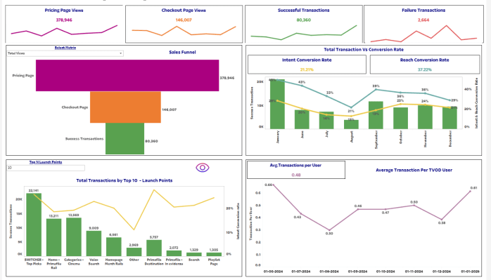
Conversion 21% (measured by transactions / Pricing page views
Future
When designing for this project, we looked at the ‘full fat’ view of if we have other variables to included such as a multitude of different quality type (i.e. SD, HD, UHD, UHD HDR), tv shows (episodes, seasons, whole shows) and then bundles (such as movie trilogies).
The main push at the start of the project would be to have a two page way of selecting as it was important, when designing at scale, to have separate pages in order to accommodate potential large variations per area.

Toward the end of the project I had the opportunity of walking through the solution with another partner to Entertainment OS. This helped to illustrate the MVP solution, but tease out how it could accommodate their needs. This also was a good opportunity to capture if anything would need to change, or where we may need to push back. Thankfully, their needs were very similar to what we had, however the future thinking would have helped if this would not have been the case.
Sadly I had to move crews before the MVP was launched. During that time another round of testing happened as well as some tweaks and changes based on ‘last minute requirements’.
My next steps, if I still had been working on developing the solution, would be to look at the data once live and see the funnel to conversion. Assess the drop outs, hypothesise as to why, then run qualitative research to answer the ‘why’. In addition to this would be to test out the detail TV show journeys and understand if there is a need to have episodes, seasons and show levels to be purchasable. In addition to this, investigate further of ‘combining stores’ such as Prime Video rentals and purchases.
