Introduction
The registration project was to create a global registration within Reed Exhibitions. The landscape at Reed Exhibitions has over 35 different registration vendors (third party solutions). The result of this is inconsistency, inability to make change at scale, low amount of control and customisation, as well as non uniformed data capturing.
The idea of a ‘Global Registration’ grew from these particular areas of interest. However it was not as simple as just building a registration to fit every business unit (which are generally divided into the different countries of operation).
The project was shut down multiple times to then finally be part of an internal rollout of systems that meant registration would be needed in house. I moved teams when it finally was going to take off and wanted to put my research, findings and work into the project to get it going quickly.
Discover
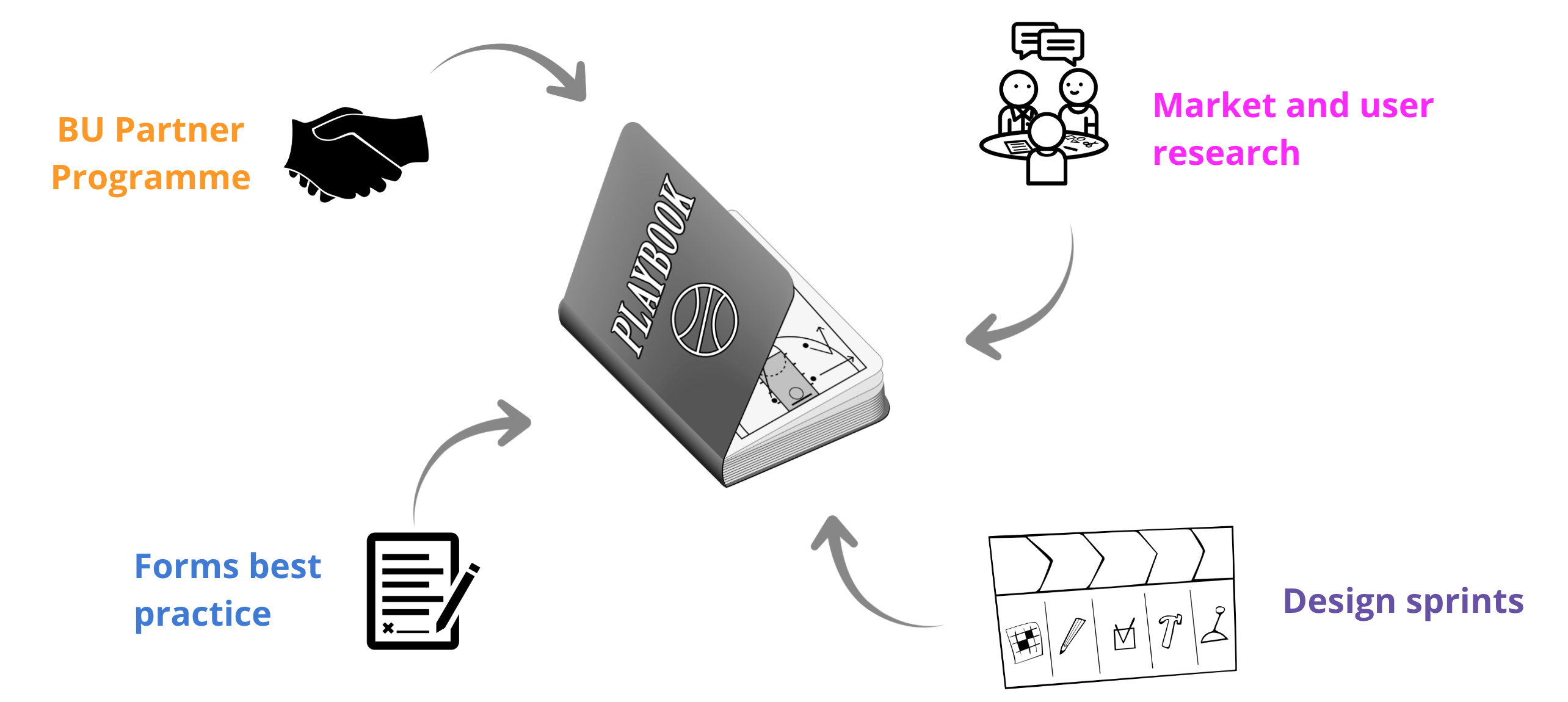
Best Practice Playbook and Partner Programme
When I first started at Reed Exhibitions a series of A/B tests were conducted as well as multiple user research studies to understand areas of improvement within registration based on several of the business units. As the global registration project did not get funding in the end there was a need for other work to be done in the meantime to improve registration, which was the birth of the Best Practice Playbook.
My role in this part of the project was to work closely with the product owner and business analyst to package up the findings to distribute around the business. The main part of this was giving examples of the application of the ideas as well as how to implement from a UX perspective.
A/B testing: Verified recommendations
1. One category of questions per page
2. Clear value exchange
3. Remove questions of no user or BU (Business Unit) value


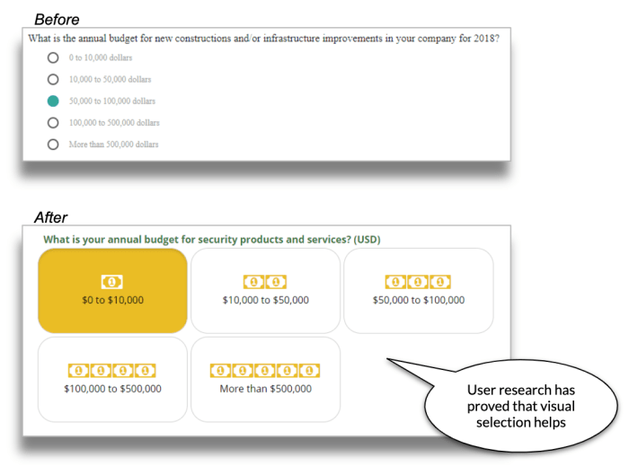
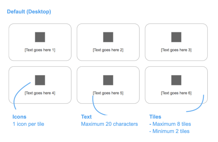
4. More visual selections for better UX
The strategy was to grow the playbook through new learnings from various activities:
The objective was to promote a healthy build-measure-learn framework, where new A/B tests will be performed to learn and improve around Registration at Reed.
Workshop with Reed Exhibitions France + Midem (Both Business units based in France)
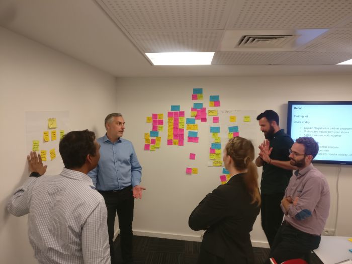
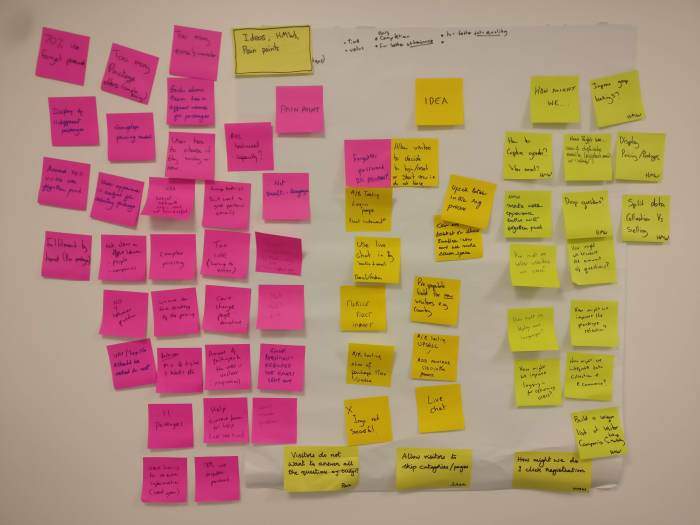
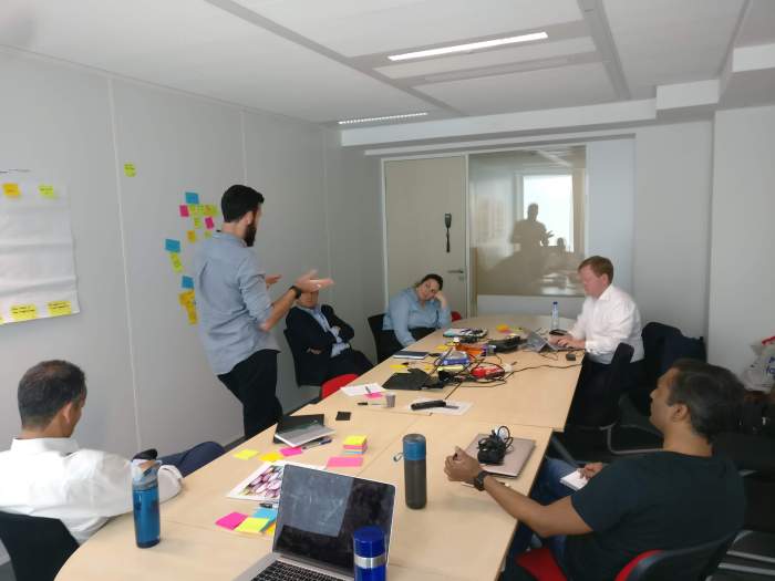

We went to Paris to do workshops with two of our BU’s. Here we presented the process and results that lead to the Best Practice Playbook. We then continued by getting the BU’s to walk through their existing registration experience. While the workshop was happening everyone was encouraged to capture notes ‘How might we?, Pain points and Opportunities. I then facilitated the affinity mapping and voting.
Workshop with Austria (remotely)
Using remote collaboration tools in order to run sessions, affinity map and vote on ideas to progress with. We followed the same process as we did with France but online over two sessions.
Wireframe ideas for A/B testing
1. Show value of online reg
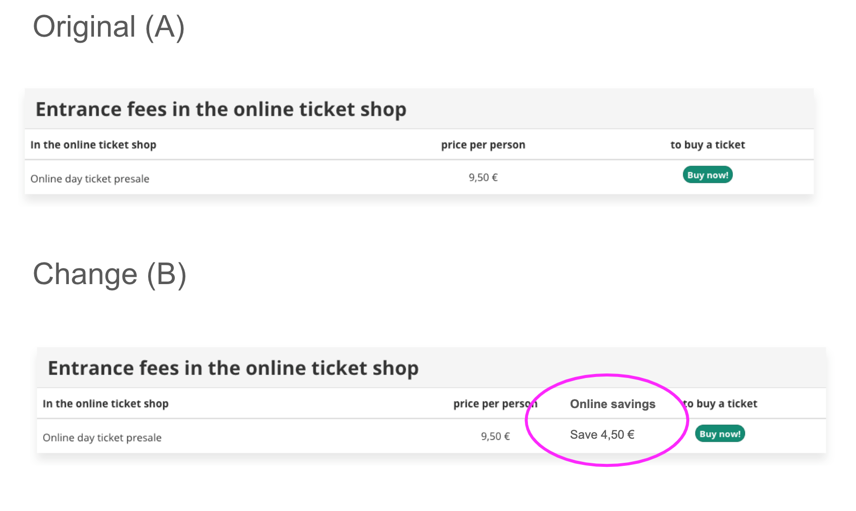
Idea/test
Value of online reg
Hypothesis
Showing the difference between online vs on-site price will show better value and improve conversion
Test
Price difference shown between online and onsite
Measurement
Click through
2. Prioritise online registration
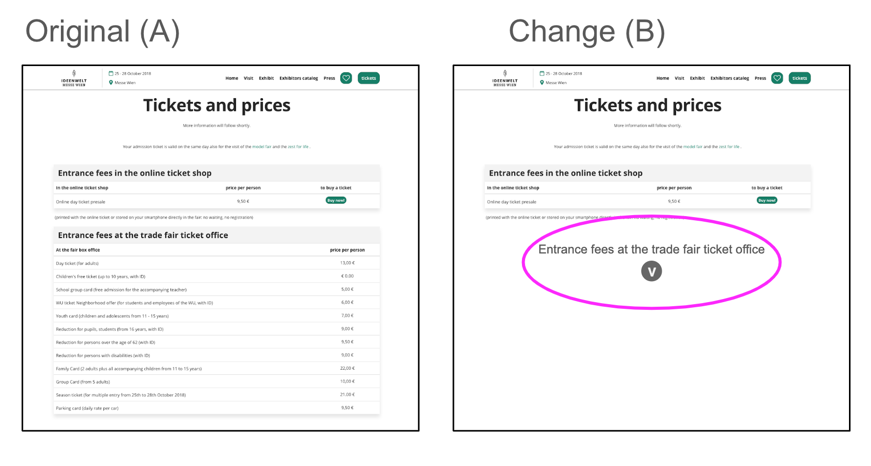
Idea/test
Collapsing on-site pricing and information
Hypothesis
Making the online ticket more clear by having the page less distracting
Test
Collapsing on-site information
Measurement
Click through
3. Remove landing page
Idea/test
Remove landing page (for reg with only one option) and navigate to the registration journey
Hypothesis
Removing the landing page will improve conversion
Tests
Remove landing page
Measurement
Conversion
Pilot test
- Focus and ideas generated over a series of workshops between Austria and the global reg team
- The Landing page is the page on the marketing website that sites in between the registration/buy-tickets Call To Action and the online Ticket Shop
- The landing page was chosen is it has the potential to have a high impact, but with a low effort to setup the tests
- The hypothesis is that by either improving or skipping the landing page we can drive more people into the registration funnel
- The test(s) will be accurately recorded via an A/B approach, so that results and learnings can be shared.
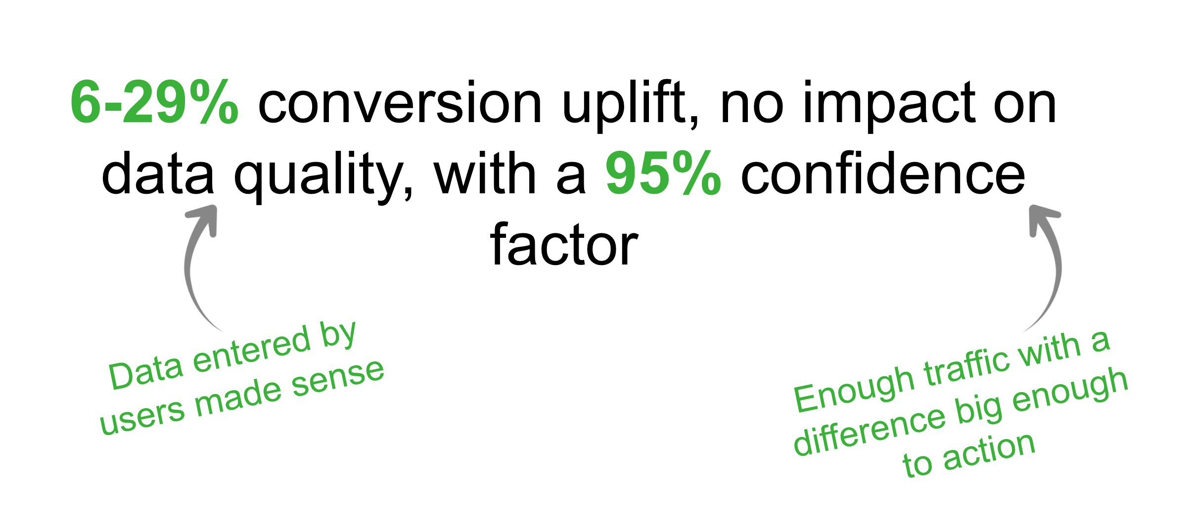
Results
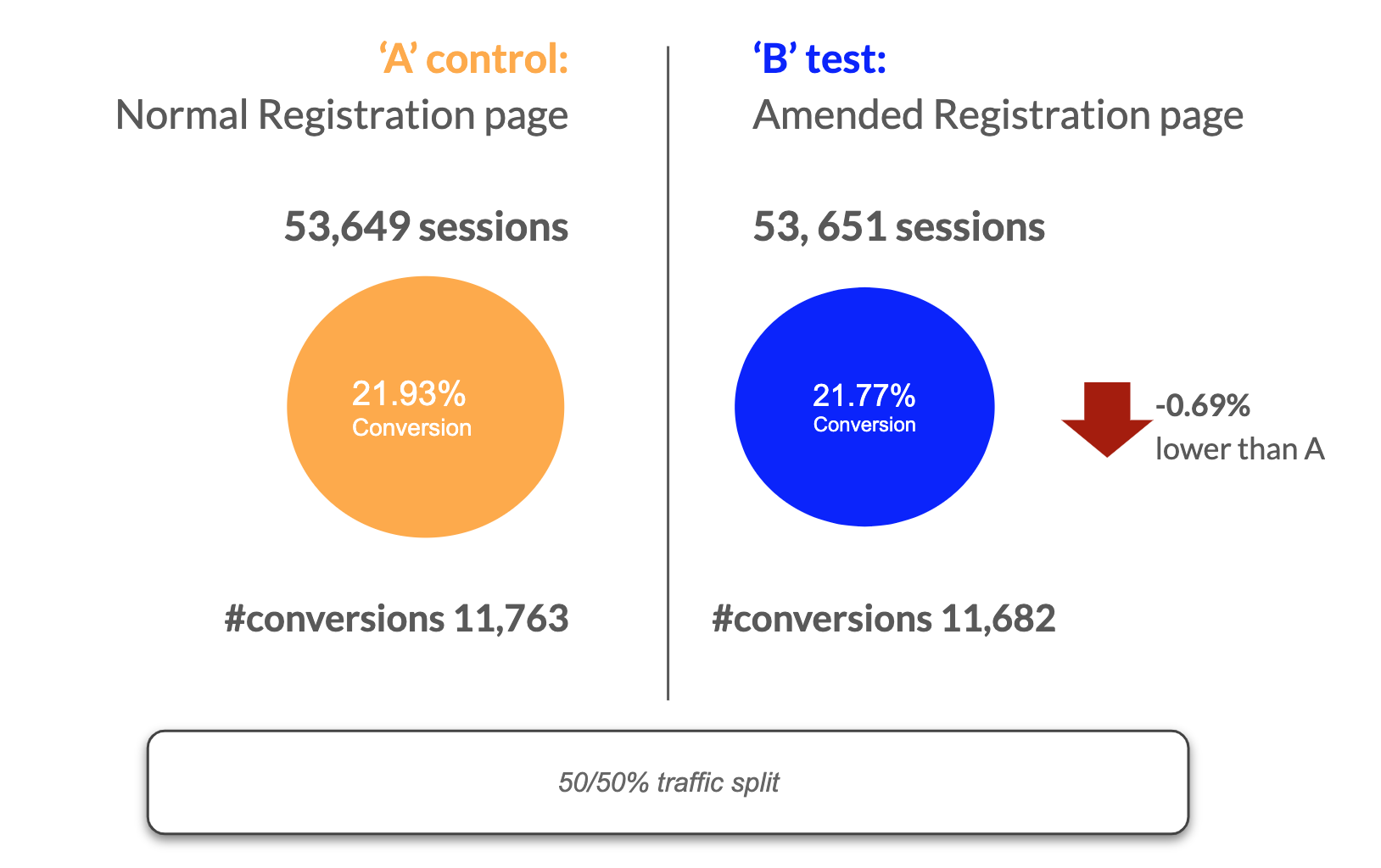
The test result is not significant – The observed difference in conversion rate (-0.69%) isn’t big enough to declare a significant winner. There is no real difference in performance between A and B.
We additionally conducted four more A/B tests with different business units. The issue we had again and again was understanding all the different variables (most of incoming traffic) to the solutions. Due to this the majority of the time the results were not valid. This came as a ‘blessing in disguise’ as this would be one of the main points to drive why the business would need a Global registration. Global registration would have more control over these types of experiments that in turn would gain many learnings for the business and ultimately improve the user experience.
Research and testing
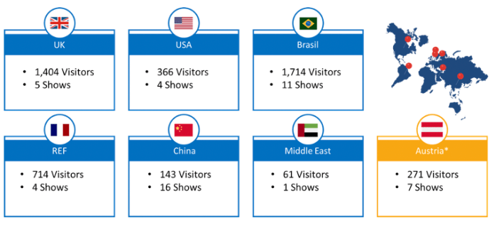
More than 12 different pieces of research were conducted including interviews, usability testing, and a global piece of research conducted with over 4000 users.
Global registration research
My role was working with a research agency to gain better understanding globally of registration. I gave feedback in regards to the different questions we wanted to ask and as to how we would want to cut the data once the research was done.
Research objective
Building on previous insights, to carry out a broad and far reaching assessment of registration globally, in particular covering key markets UK, US, Brasil, China, REF, Middle East, Austria, and Midem.
Help provide a roadmap for global registration and allow RX to plan areas of focus; around:
- Features
- User journeys
- Pain points
- Expectations etc.
Research method
Quantitative online survey probing on registration experience for show visitors.
10-15 minute survey: c.30 questions
(survey in English, French, Portuguese, Chinese & German)
We spoke to a mix of 4,676 visitors from 48 different shows across 7 different BUs.
Executive summary
- Visitors are generally satisfied with the registration process, and rate it highly compared to other aspects of the show.
- There are some consistent issues with the perceived relevancy of some questions and length of the process. This leads 39% of visitors to skip or rush some parts of the registration.
- The current perception is that registration primarily benefits the show BUT visitors generally feel more positively about the show when told the questions are to enable tailoring of content and matchmaking recommendations.
- Furthermore, when the benefits of each section are explained, visitors state they are significantly more likely to complete each section.
- Visitors are also frustrated by the lack of expected features such as pre-populating previously shared information, allowing them to edit information that has changed and add more information as they get more time or have the correct information to hand.
Define – Global registration
Best practice (competitor + comparator) summary
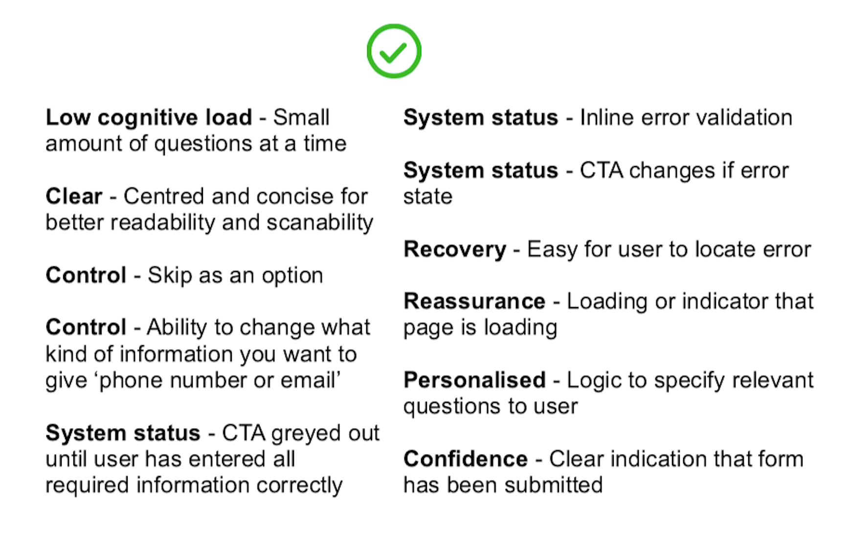
Looking at the competitors and comparators and what is general best practice for registration. Using a heuristic evaluation I came up with the following best practice for registration.
Match Making + Registration vision workshop


Collaborative workshop between the Match Making team and UK show team to get feedback and input as to how registration would affect the recommendation experience for users. Important to use workshop to gain understanding and input from other teams in order to create solutions based on business perspective.
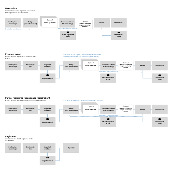
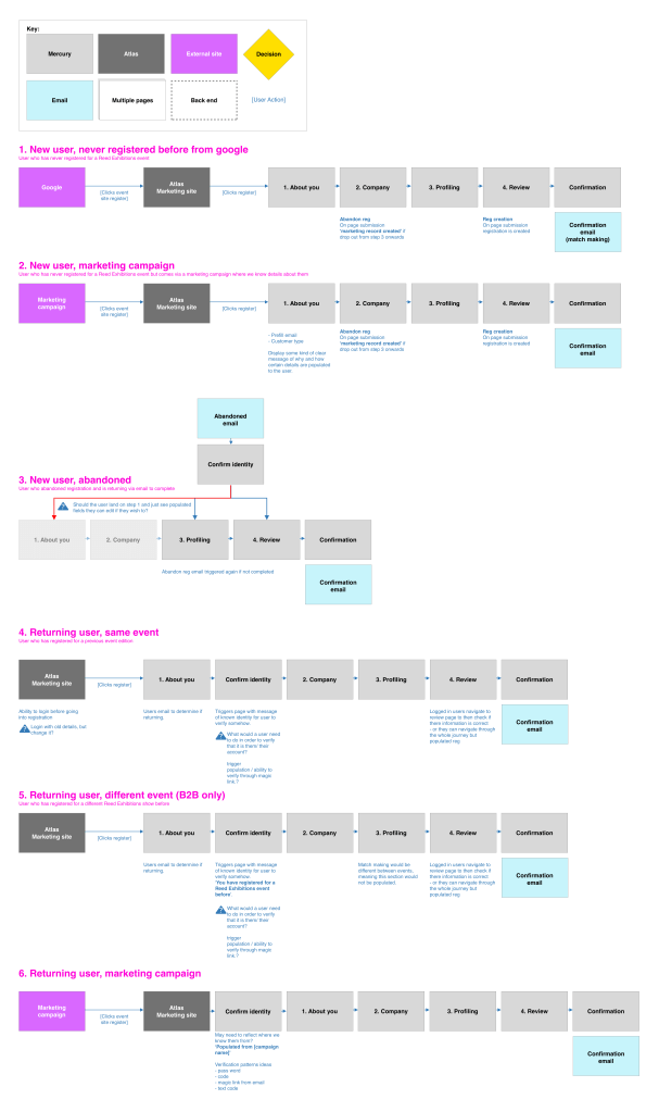
User journeys
Registration had initially four specific journeys for different user types. This would be based on if a user had registered before, if they had partially registered, or if they had already attended an event.
Pitch prototype
Now the requirements were gathered, best practice was researched, it was time to put together something more tangible to showcase to the various stakeholders in the business. I was tasked as stitching the requirements and findings into a prototype of what the future of registration could be within Reed Exhibitions globally.
Configuration
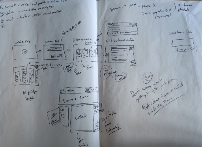
In a similar vain to the pitch prototype the configuration part of registration was important as to how teams would setup a registration. With the principle of ‘Zero configuration’ the idea would be to focus on how most functionality would come out of the box but also be a platform that would educate around the business as the data would be aligned and visible at a global level.

Mercury – A new beginning
During my time at Reed Exhibitions, the registration project did not have a smooth production. Due to the nature of the work and the scale of the project the budget was pulled several times. Finally, a team called ‘Mercury’ was setup to tackle registration and other parts of the business globally. I moved from the Visitor team to Mercury in order to complete what I had started, as well as a valued member of the team to transfer my knowledge and hit the ground running.
MVP – Free Basic Online Registration
Working with the Product Director, business analysts, a product owner and tech, we began to pull together what the first iteration of registration would be. The solution would leverage the Forms solution as a starting point and would then need fleshing out in order to work for a global registration.
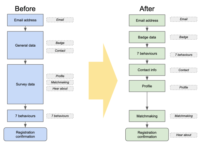
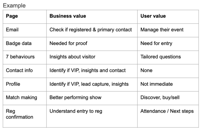
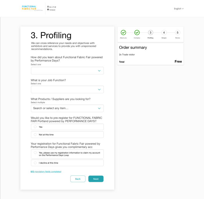
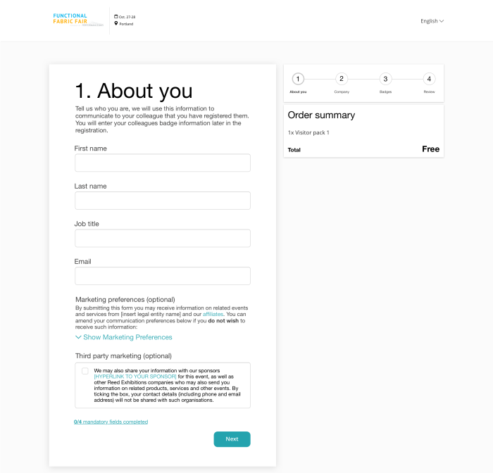
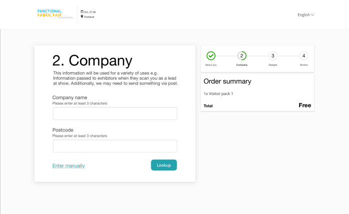
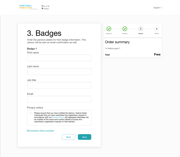
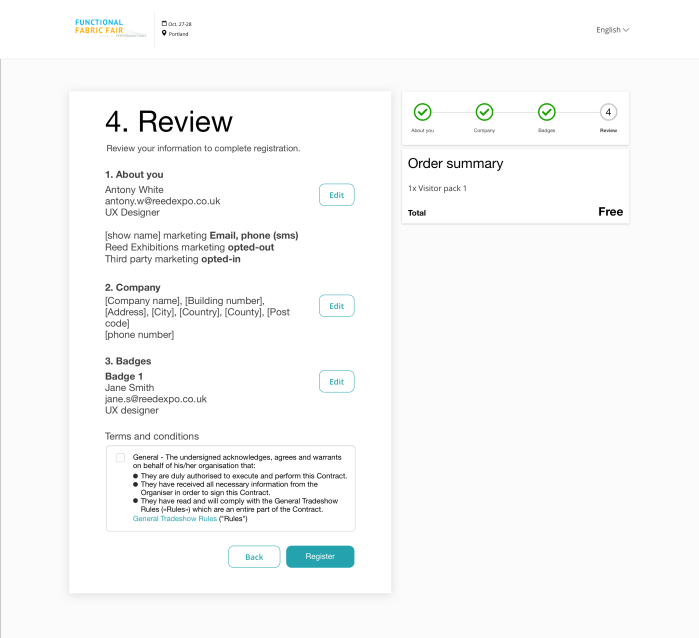
Registration journey
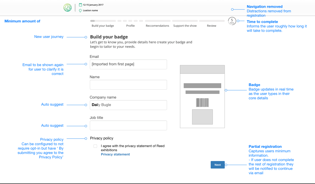
Working closely with Business Analysts to understand the different requirements and how those could be packaged for a user. From best practice, it was seen to be more successful to ‘chunk’ information, so using this basis or assigning each different type of data capture as a page.
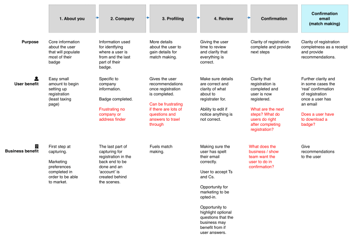
Main data to capture
Core information
To get the minimum information needed to create an ‘account’ for the user
Company information
Understand where the user is from and where they work
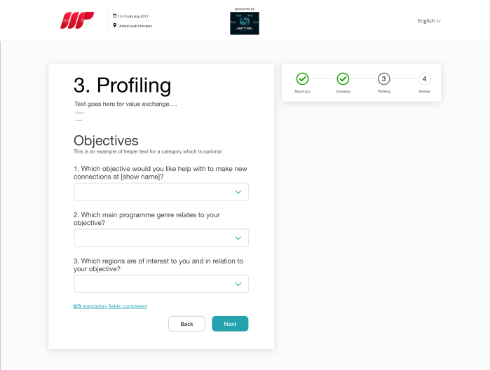
Match making capturing
Capturing what the user has to offer and what they are looking for to create match making and serve up recommendations of exhibitors, participants and sessions
Develop
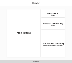
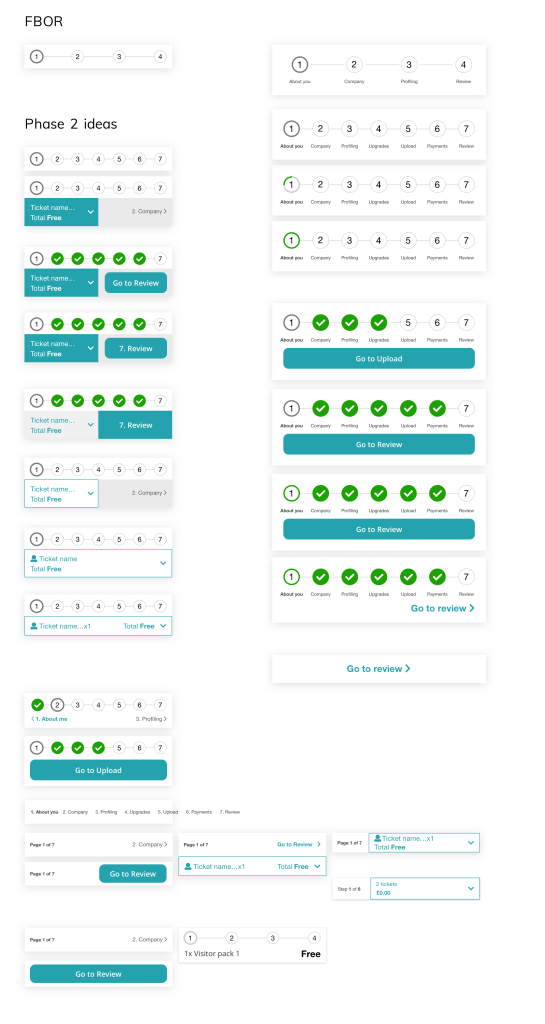
Page structure
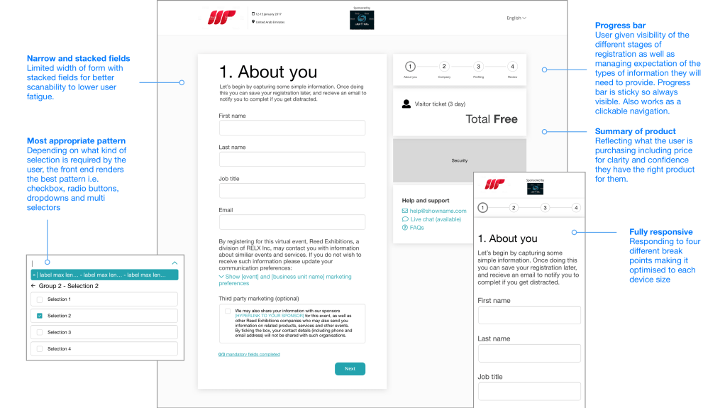
I had designed a form solution prior to this work. Now it was about repurposing into different pages. I focused at the beginning to set the structure for registration looking at different aspects, but focusing on what we could get built quickly in order to put in users and get feedback.
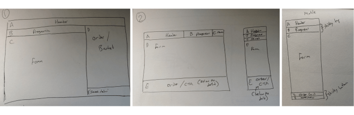
At Reed Exhibitions there are 4 different breakpoints for sizes we support for devices. This was looking at how those devices may work for registration.


Registration pages
Work shops and discussions with the team and basing on research and best practice, we got to a point where we had a registration flow that could be used. This was then refined and cut down in order to deliver an MVP.
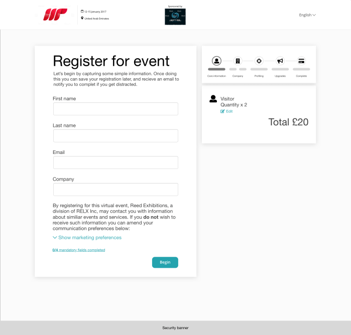


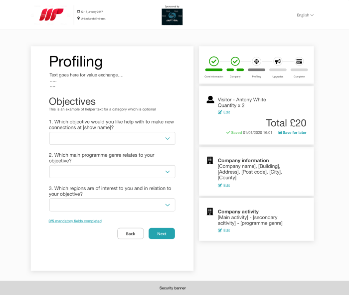
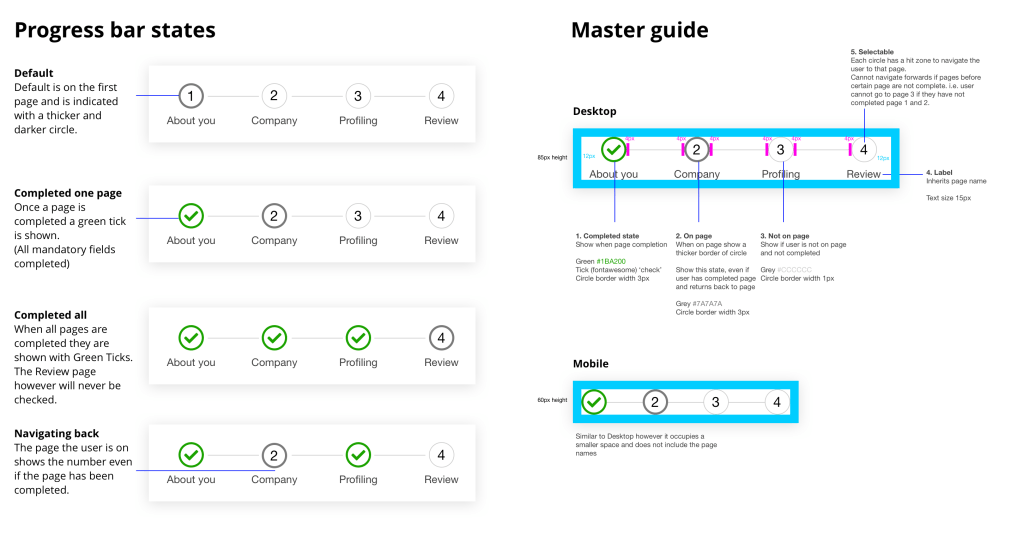
Progression bar
The progression bar was a new component that would be useful for users to understand where they are within the flow, to help them navigate and reassure of what they have done and what they need to do.
User testing

Testing method
Interviews and usability testing (moderated by Mindmover)
Users
6x Visitors (customer panel)
Devices
Desktop (in the end there were no users we found who would normally register on mobile, so were unable to test)
Stimulus
Reg build (FBOR)
Objective and summary
To test out the initial build of Free Basic Online Registration (FBOR) to answer the following:
- How usable is the updated registration? [clarity, flow, length]
Very usable. No major issues were flagged.
However, as registration gets more complicated going forward, registration will require further research, potentially for different user types. - What happens when the user encounters an error?
Users are able to recover from errors easily from what has been observed. As mentioned by one user this would work for pages even longer than those within FBOR due to the scroll to error. - Are there any questions that users believe to be unnecessary or intrusive?
Due to the size of the registration it was seen as quick and simple and just asking the core questions. May need to test with an actual registration going forward to gain this insight. Also this may vary between shows. - Is there anything else that the team needs to be mindful of/investigate further?
Marketing preferences seemed to be an issue as they were not noticed by the user, and there was confusion between marketing preferences and third party marketing preferences.
Deliver
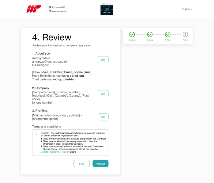
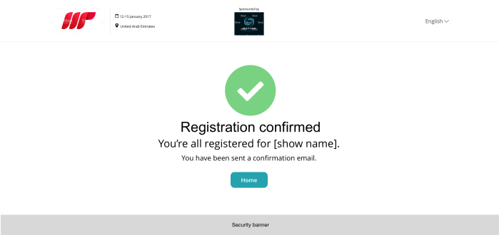
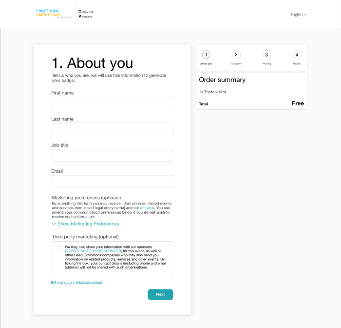
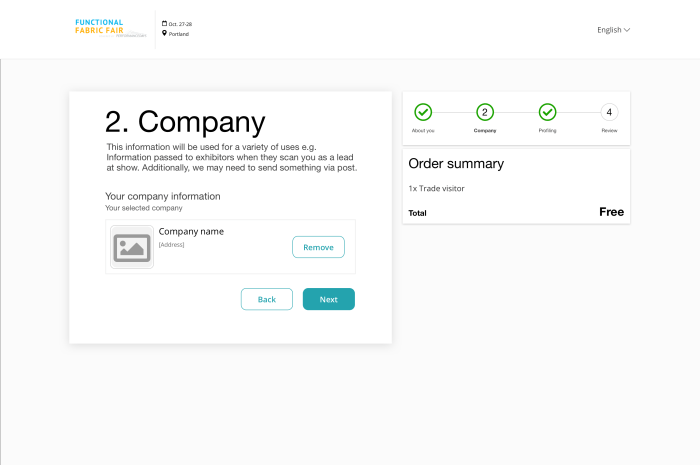
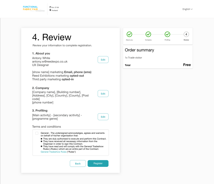
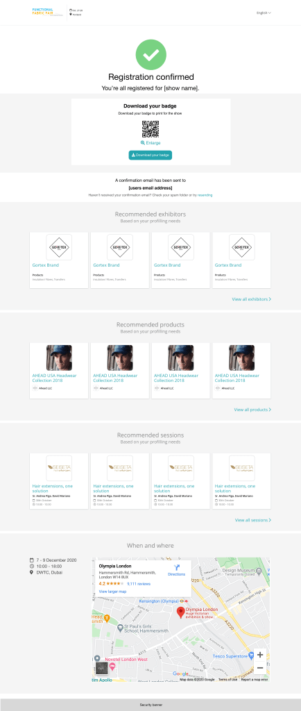
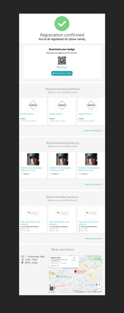
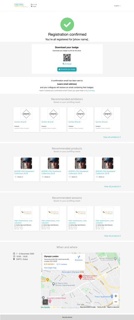
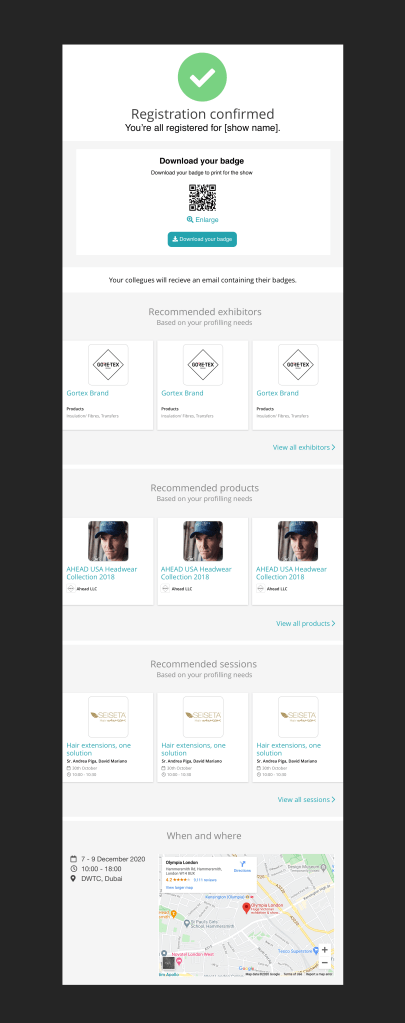
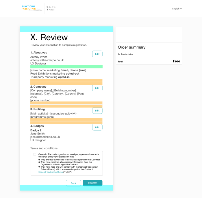
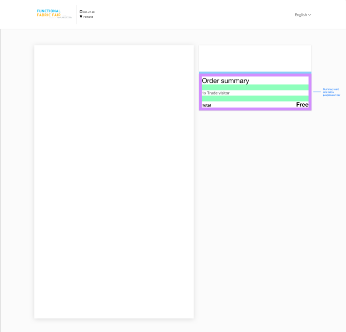
MVP – Release 1
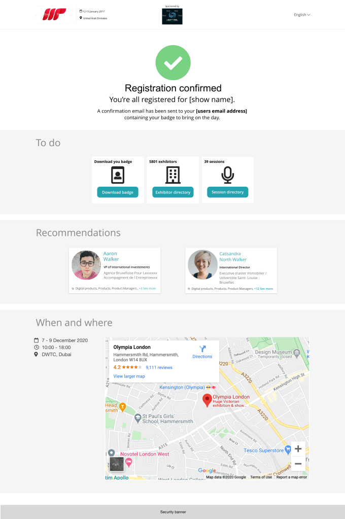
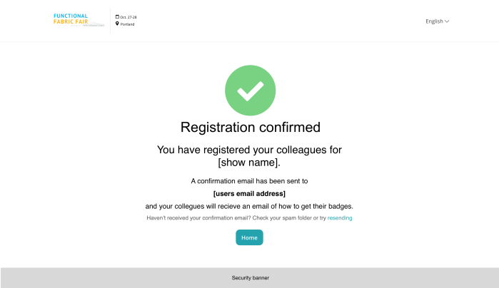
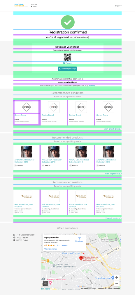
The aim was to release a basic online registration as a starting point. This consisted of multiple pages, a progression bar, improvements to the form for navigating between pages, and several new patterns for easing usability and business requirements. Additionally a basic confirmation email was built as a starting point, which would then be expanded with stakeholder interviews to begin with.
MVP – Release 1 screens


Global registration – Best practice examples
Videos demonstrating best practice in action for global registration build.
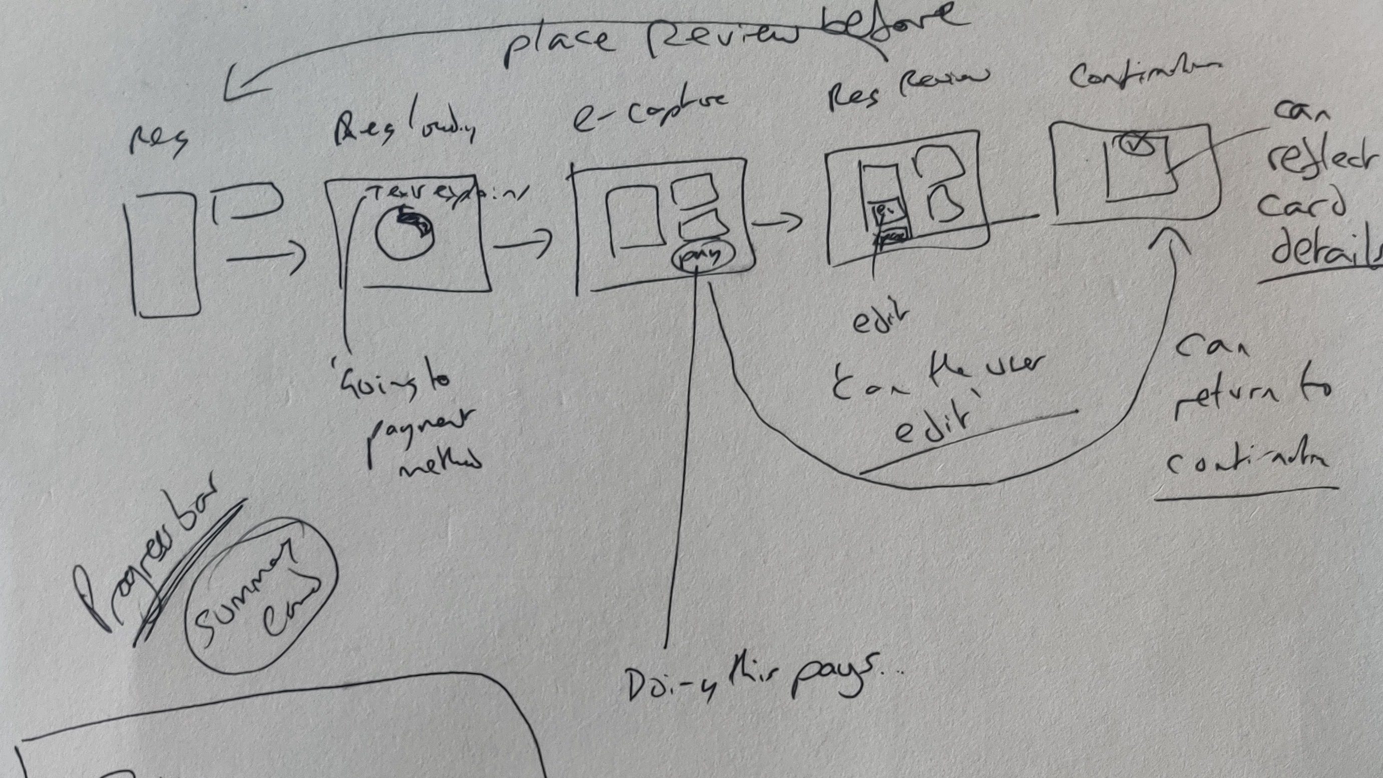
Pilot (Functional Fabric Fair)
The next build would be to develop and optimise further as well as bring in new requirements to suit the need of the show. This was orchestrated by revisiting areas that had been fleshed out but not built and putting together a click through prototype of the registration specifically for Functional Fabric Fair to walk through the shows stakeholders.
This prototype additionally added changes made from the user testing and fleshed out areas of the build that were not initially needed.
Stake holder walkthrough
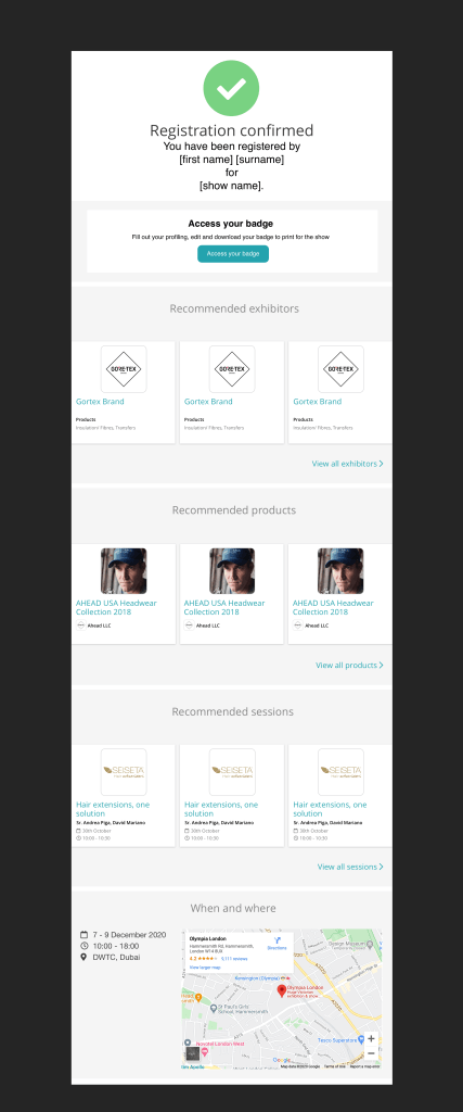
Using the prototype we walked through the Functional Fabric Fair show team. This then was used as a point to gain feedback and hope to prioritise the needs for the second build. The feedback helped us consider areas that may need work, and others that could be looked at in the next iteration. This build would be treated as the pilot for global registration, and by no means would be the end of this project.
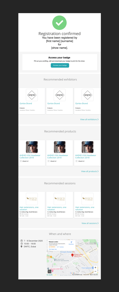
Additionally we worked with the match making team at the recommendations shown on the confirmation page and email and went with the approach of producing an idea to work from rather than waiting for requirements. This as well worked from a technical perspective as we warmed up the tech teams in advanced.
Prototype journeys
Screens put together into click through prototypes to communicate the journey and basic interactions in order to show the flow. These journeys represented who the user was registering for as follow:
Journey 1 – Registering myself prototype
User only needs to register themselves. This would be very similar to the initial build.


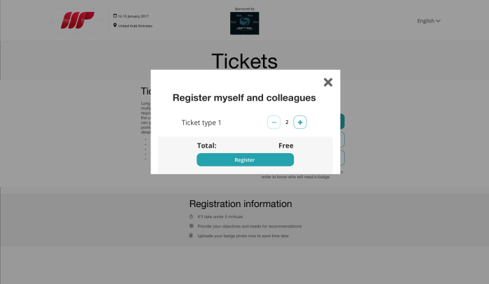
Journey 2 – Registering myself and others prototype
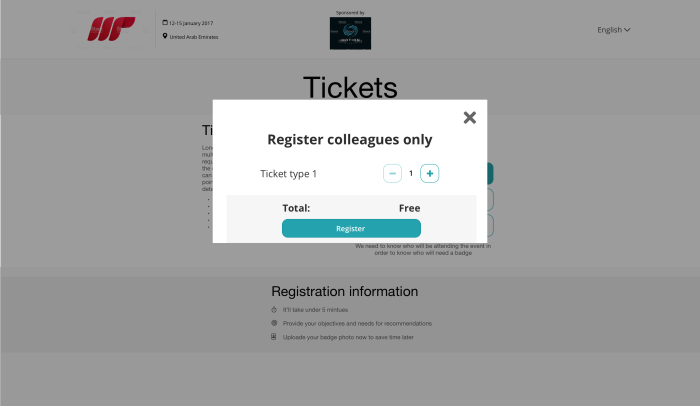
Differing from the original build, a modal would ask a user how many people they would want to register. In the journey its communicated the different between the person registering, and who they are registering for.


Journey 3 – Registering others only prototype
Similar to registering yourself and others, however, the person registering would need to give their details in order for the person to know who has registered them.

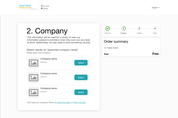
FFF solution
Building on the first build the second phase would include:
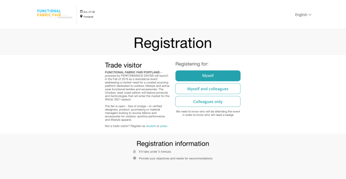
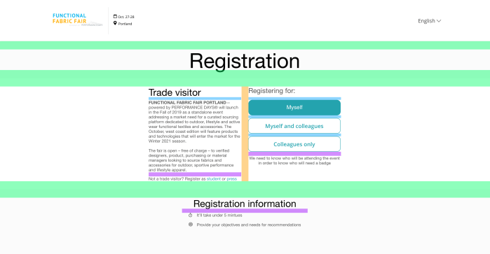
- Landing page (ticket type selection)
- Capturing if user is registering themselves, themselves and others, and others only in order to serve different user journeys for better quality data capturing
- Improved marketing preferences (based on testing feedback)
- Company lookup (for user to find company rather than typing)
- Badges page that would be used if user would register for multiple tickets or registering for someone else
- Confirmation page and email to be updated to include recommendations for exhibitors, sessions and products
FFF – Specification
Adapting the current solution and indicating the changes and details of spacing mostly. Below are the examples of changes and key for desktop changes.


Future
Prototyping
I wanted to try some animation ideas for registration. I used Adobe XD to help with demonstrating animation and small interactions to developers. This proved as a better way then just a simple click through prototype as it demonstrated the desired animation and motion
Next steps
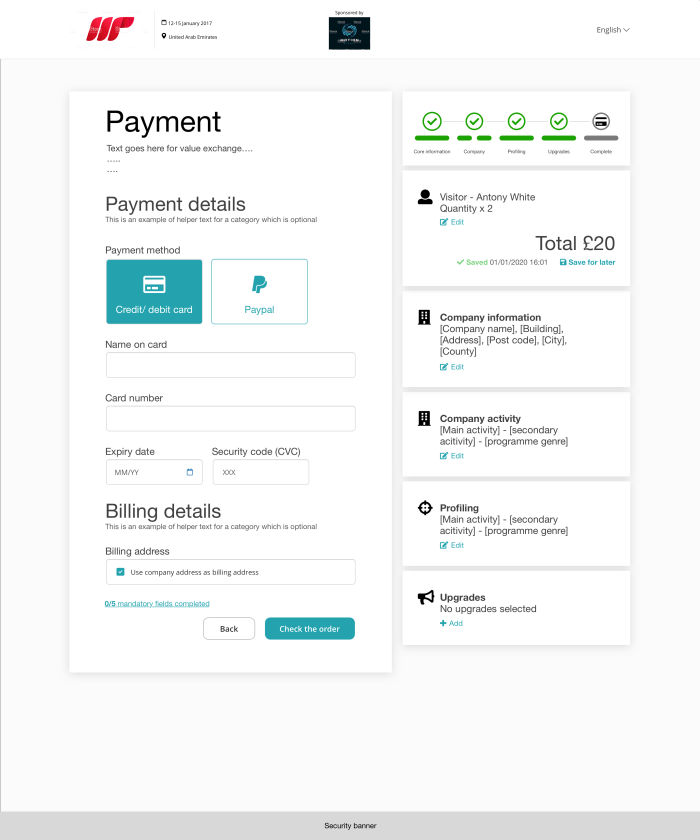
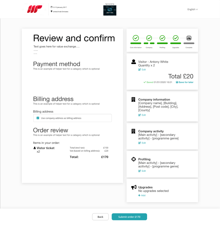
My time at Reed Exhibitions came to an end as I found a new job opportunity just before the pilot went live. The aim was to launch and gather data and interview users about there experience to feed into the next iteration. I had worked on various aspects that would be the focus of the next iterations, but did not get to a point of completing them. Here is a list of the different areas that would be workshopped, detailed and tested going forward:
- Registrations built for the other different user types
- Payment integration
- Capturing billing address
- Photo uploader
- Registration header (AEM changes)
- Shop related content (i.e. upsell)
- Detail configuration UI
- Optimisation
- Launch with A/B test
- Further testing with more complex journeys
- Testing for different user types
- Scale for global solution
Other Reed Exhibitions projects
