
Introduction
The forms project was to create a global solution for forms that would be used by all the business units at Reed Exhibitions. Business units would be given the means to build their own forms for a variety of different purposes and use them on their event sites.
Discover
As forms were nothing new when it comes to the web, the initial research done was using the best practices that are already in use. Looking at UX articles online accumulated a lot of knowledge of how to create forms and also validation on testing done by other organisations such as Google.
Competitor analysis (UBM)
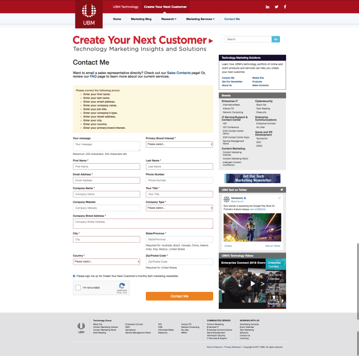


UBM are similar to Reed in their solutions with their forms. There are many issues that they have and it seems that they use third parties or not the same form solutions.
Their biggest issue is around their error handling as it generally had examples of poor sign posting or not guiding the user to the issue. However they have examples of good error messaging that adapts to the specific issue, which is a lot more beneficial to the user than a generic message.
Overall most the issues are not that severe, however they are not the best example of best practice, which would be more relevant to use Comparator analysis for a better understanding on the state of forms from other industries.
Comparator analysis
Analysing comparator examples of best practice of form design for a better view of the possibilities of our form solution. There were more innovative and creative ways for forms solution looking at comparators, compared to competitors. Additionally animation and ways of paginating the information provided different ways of presenting and capturing user data. I looked at the following sites forms:
- Typeform
- Jotform
- Google Forms
- GOV.UK
- Snapchat
Low cognitive load – Small amount of questions at a time
Clear – Centred and concise for better readability and scanability
Control – Skip as an option
Control – Ability to change what kind of information you want to give ‘phone number or email’
System status – CTA greyed out until user has entered all required information correctly
System status – Inline error validation
System status – CTA changes if error state
Recovery – Easy for user to locate error
Reassurance – Loading or indicator that page is loading
Personalised – Logic to specify relevant questions to user
Confidence – Clear indication that form has been submitted
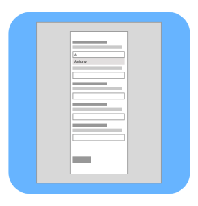
Benchmarking (existing Reed Exhibitions forms)

Auditing the different forms from read byidentifying what usability issues there are in order to begin to apply best practice to forms.
An audit of the different forms on desktop from:
- Austria
- Japan
- China
- Mexico
- REF
- UK
- Midem
- US
UX Best practice and Existing research
Forms are nothing new when it comes to the world wide web. Doing desk research and looking at what other companies and UX professionals have done. Rationale and previous research compiled together were then used to form the principles and best practice for forms.
Stakeholder interviews
Writing and conducting interviews with four of the business units at Reed Exhibitions. Understand their needs and also identifying areas of improvement or ideas they currently have. Used later in order to define MVP and also further maturity of forms.
Business Unit satisfaction survey
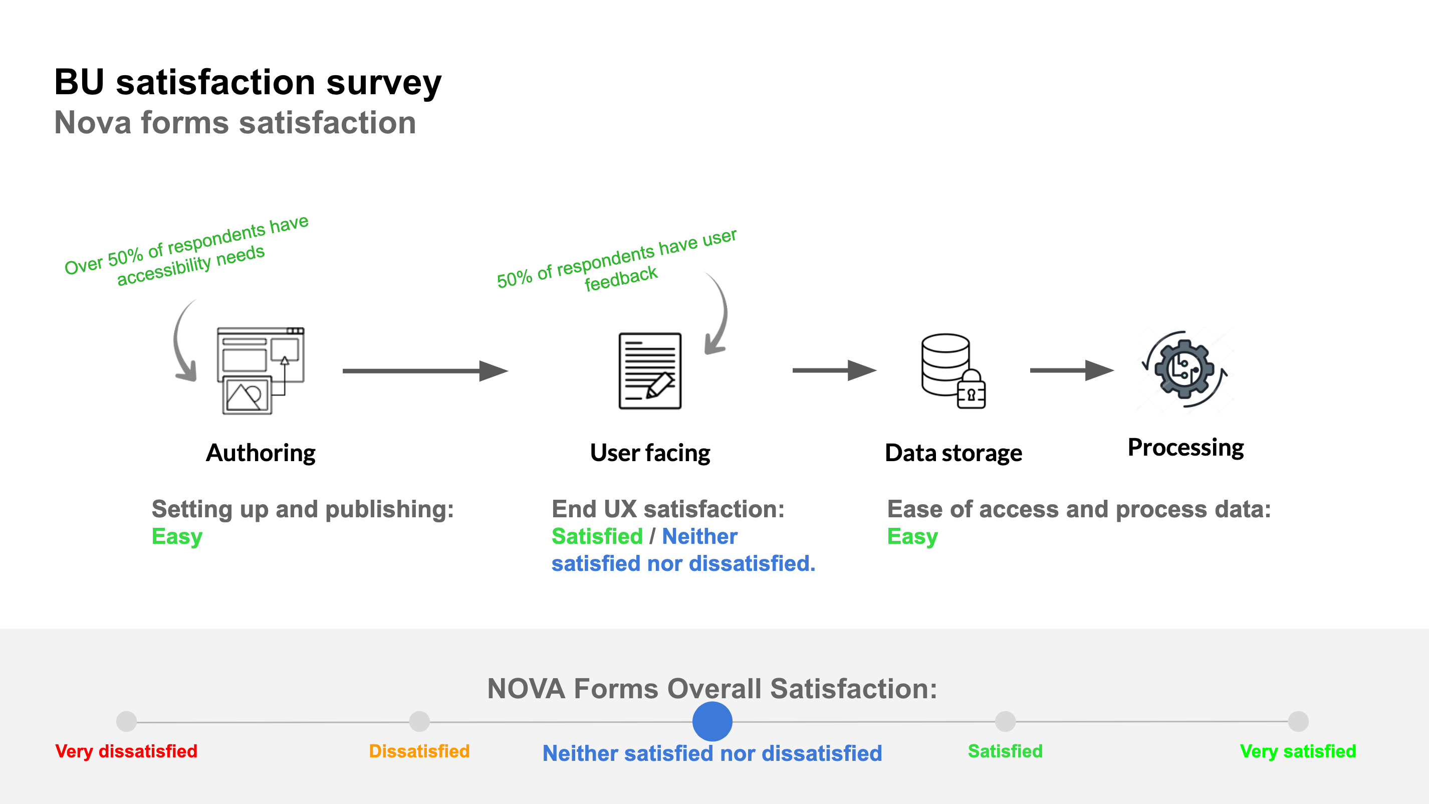
As part of the internal process for migration, it is important for measures to be taken when functionality is built. I worked on a survey that was sent to the various parts of our business who used the original form solutions. We would then send out another survey asking the same questions in order for us to see if internally it was an improvement. This also helped us understand the expectations of the internal users of forms.
Define
Synthesising the discovery phase I created design principles as the guide posts for the project.
Principles
Guide the user
The user should know what information they are providing and why they need to.
Recover easily from errors
A user should be able to easily identify an error, understand why it has happened and how to recover.
Add and amend fluidly
Entering and editing data should be easy. The user should be able to use autofill, copy and paste as well as being able to amend incorrect data rather than start from scratch.
Clear feedback and next steps
Communicate clearly if complete as well as where the user can go next. Make sure the user is aware of what they have done.
Prototyping to lead conversation
When working on how to begin to narrow down and solutionise what was discovered in the discovery phase, it was important to involve everyone in the team as early as possible. Additionally getting stakeholders input earlier as well was another one of our challenges.
My approach at this stage is to create a few designs to begin conversations. The designs are not to be the final product but are for a more tangible way of extracting needs and requirements, as well as getting technology input to what can or can’t be done.
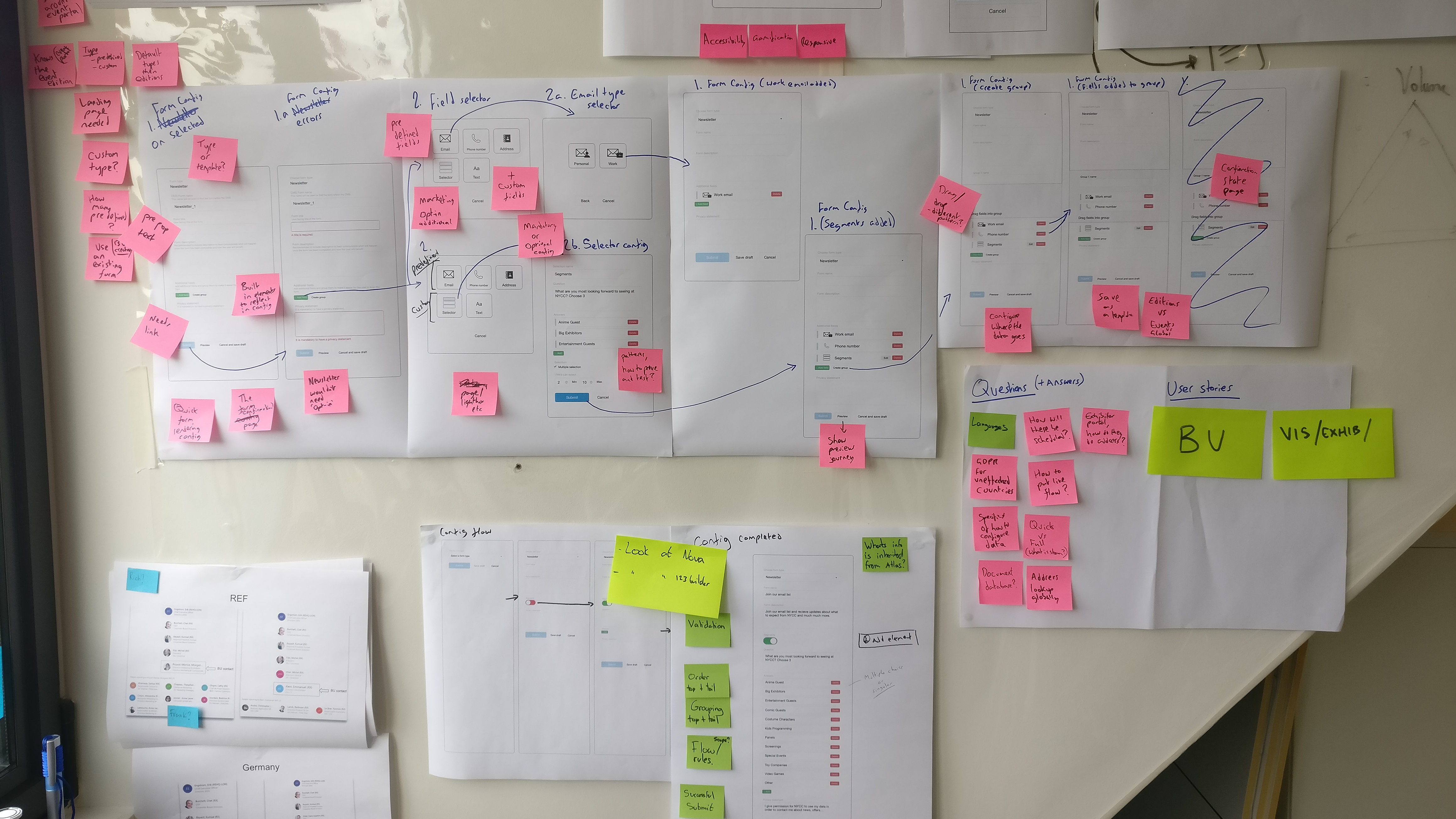
I started by putting together a basic flow of what the forms solution could be. This ‘strawman’ was then used for a workshop that I ran with the team. Through this workshop we went through the configuration journey as well as how this would be reflected to our end users.
Develop
UX team review and alignment
Taking the best practice from benchmarking, research, analysis and collaboration with technology, the next step would be to review and align with the UX team. This would involve many sessions going through patterns that would be required as to whether they exist elsewhere, or others are working on similar functionality. We also would go through the interaction design and usage to collaborate and make sure we all had our input.
Collaborating with developers
Once getting into detail from exploration of interaction design and feedback from the UX team it was important to work alongside the developers. The global platform uses bootstrap libraries. Going through the patterns and interactions required, I worked with the developers to identity what can come out of the box as close to my designs as possible. There were a few functionalities that were even better for the user in some circumstances making this collaboration even more vital for the user as well as managing build time.
Testing
Multiple rounds of guerrilla and face to face interview testing was done. Working at Reed Exhibitions means that we can attend the shows we are running and access actual users. This meant doing face to face interviews by intercepting those at an event to get them to fill out a form and give feedback. Challenges of testing the form were the subject matter, which meant that a user would need to use a specific form in order to not get distracted or confused with the subject matter. This proved to be the most difficult part of testing. However, as a lot of research found during discovery showed, a lot of best practice had been validated, so for our solution it was doing something rather than doing nothing.
Additionally guerrilla testing was done mostly for the admin configuration journeys for building a form, as these would be some of the users who would be using the forms builders in future.

Finally using User Zoom for unmoderated the testing I created a generic example form and simply asked users to fill it out. This was to look at how a user navigates a form, where abouts they click, if they cause errors are they able to recover and to compare the results between desktop and mobile users.
User Zoom form testing findings:
- Users in the test filled out the form in a linear order
- Users on mobile understood the optional fields more than the desktop users
- A large amount of users did not mention if a field was optional and filled in the data
- The Marketing preference was the field most skipped as they assumed they had choice to not opt-in
- Select usage had a mixture of different ways a user made a selection by clicking on either the checkbox, text or white space
- The Checkbox itself was selected with 50% of use while Text was 25% and White space was 25%
- Some users clicked on multiple parts of the selector
- Out of the users who created errors the majority of desktop found it easy to recover compared to those on mobile
- However, the reasons for struggling to recover were around the subject matter i.e. superheroes and a negative view of making Marketing opt-in mandatory (which conflicted with the copy)
- The ‘fields completed’ pattern was not seen by most users and was unclear what it does
Crash party
As part of the process within the workstream we performed a crash party. A party involved the whole team using a variety of the top used browser and devices and trying multiple scenarios ouch, such as low bandwidth, interactions and error handling. By doing this we were able to find around 30 different errors and bugs. The next step was to prioritise based on how much they would affect the user. These were then raised within the backlog, and the ones labelled as critical were fixed before forms was released.
Deliver
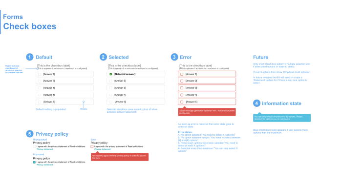
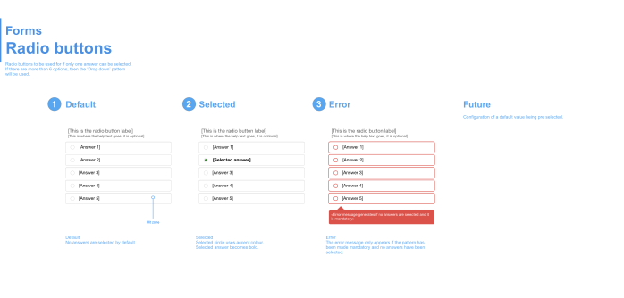
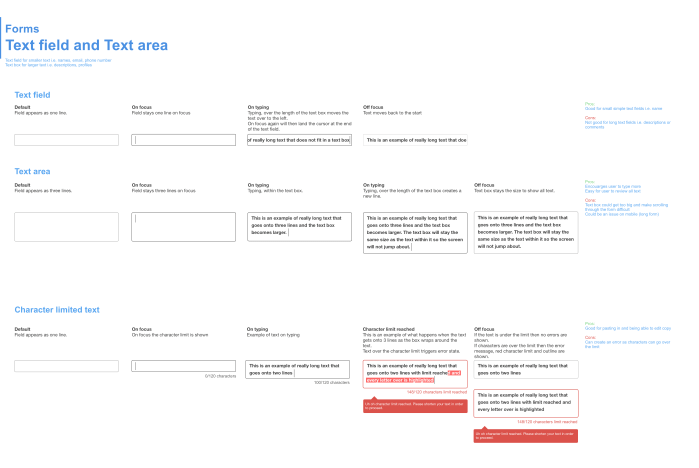
Best practice
An overview of the best practice built into the forms solution.
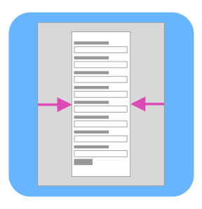
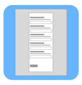
Limited Width
Narrow for best readability and lowers fatigue.
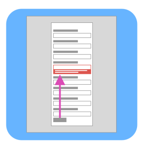
Scannable
Vertically stacked fields and labels for quick scanning which lowers fatigue.

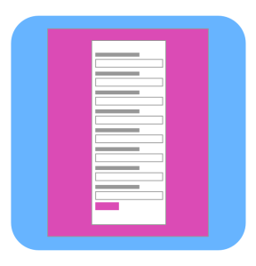
Quick error recovery
Inline error messaging with scrolling to error for quicker error recovery.
Error messaging disappears once issue has been fixed.
Tailored error messages for better guidance.
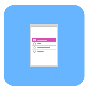
Most appropriate patterns
Patterns generated around quantity of options for reduce cognitive load.

Helper text
Above the field. Always present. Not obstructed by drop downs.
Responsive
Responsive built for the best experience on each device.

AEM friendly
Adopts colours and styles from AEM for event edition, to be consistent with the sites design.
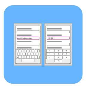
Keyboards for fields
Triggers the correct keyboard for different fields on mobile: Text, Email, Number.
Large hit zones
Finger friendly on mobile with larger hit zones and clarity of what is clickable no matter if left or right handed.
Auto complete
Supports auto complete to save the user time.
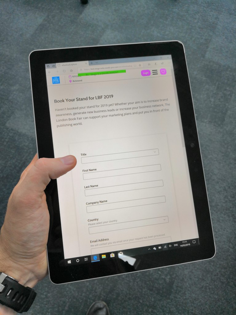
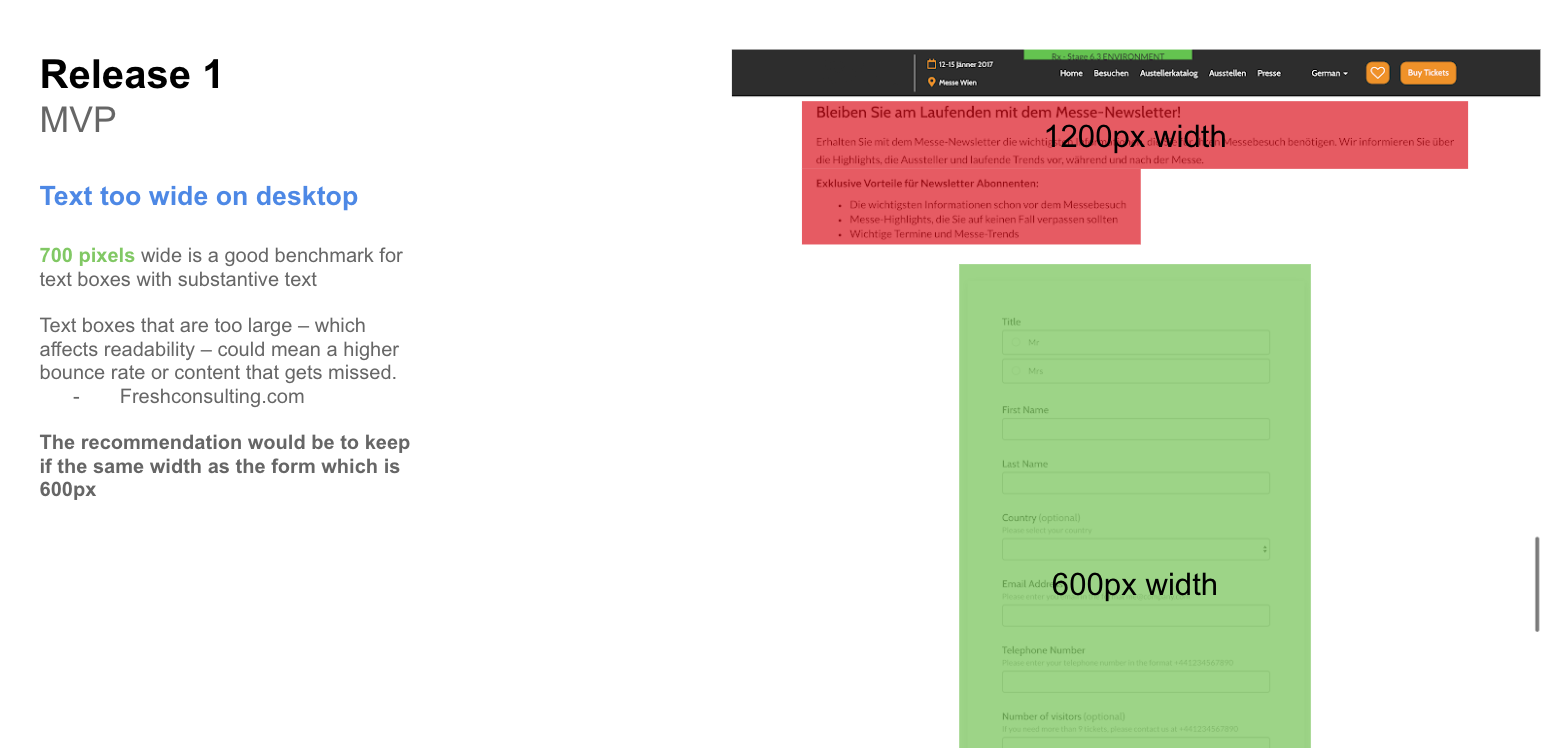
Release 1 – MVP

The first release of the forms was to create the front end component that could be configured by code to begin with. The front end was broken into stories of the different functionality. Through business units and user testing we were able to prioritise and understand what would be the minimum work we could do but delivering the best value.
After release one, it was important to analyse the further impact of the form within our global platform. For example, the maximum width for text should be 600px or below, however over components within the site were not built this way. It was important at this point to educate the best practice around the business and illustrate the impact to the user.
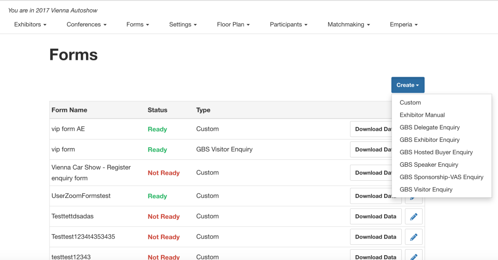
Release 2 – Admin Configuration
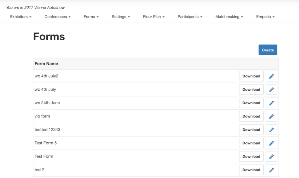
The main focus was to have an admin configuration for a form, a form builder. This was developed in the area of the global platform, the event portal. Similarly to the forms component, the admin configuration would focus on the best value features first to then be addressed in later developer sprints. As well as the configuration controls, small updates to the UI were built.
Release 3 – Salesforce integration
The main purpose for release 3 was to integrate into Reed Exhibitions Global system. For a UX designer there isn’t as much work to be done here, however certain functionality was locked off so disabled states and guidance were the main priority to convey information to the admin user, but also sign post as to what to do. This part of work was crucial from an internal data perspective to be more compliant as well as complete an end to end solution.
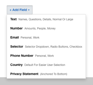
Release 3+
This backlog ran in parallel to release 3. This was to deliver the missing functionality that was originally planned. Here the forms in the front end as well as the backend were to be matured. We developed richer forms that could then be configured with a title and description, as well as the ability to chunk up the form its categories. Other features such as email alerts to users for confirmation and also to admin to know when to action a form were also built.
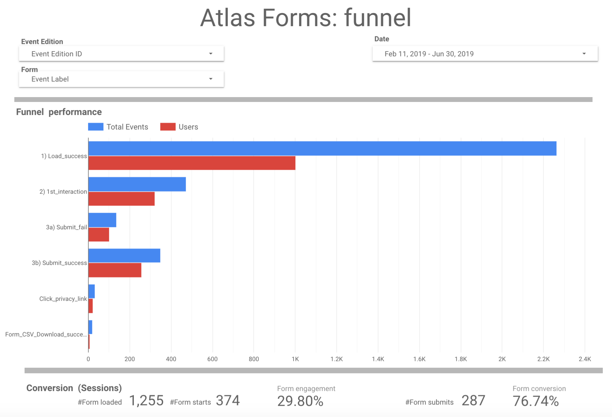
Measuring success
As part of the project, tracking and analytics were implemented, empowering the team to understand the usage and performance of forms. Our business analyst created a Forms dashboard so that we can look at performance. The snapshot here indicates that the forms conversion is just over 76%. We can also see there are a number of users who fail, which this then made us investigate the reason. There are several definitions which include throwing errors. On inspection however, a summary pattern was created for the user to find fields they did not complete, this in turn on the analytics side is flagged as an error. This example shows how we use the analytics in order to improve and optimise our products for our users.
Future
There are still many areas that are planned to develop the forms further. As part of the business the forms themselves are a potential to be used as a registration, which is where the project began in the first place. Having an end to end solution in place gives an opportunity to leverage the build and best practice into other areas of the business.
Conclusion
The forms solution now provides Reed Exhibitions with the means to create a variety of different forms and also host the data internally. Additionally tracking is now in place for us to understand better how the forms are performing in order to feedback to where we can focus on improving.
The forms as well are used internally to capture business units satisfaction survey providing a ‘full circle’ of the old solution and the new, by actually using our solution.
The business currently has over 36 different registration solution in place (mostly 3rd party), one day the aim will be to have a global solution, and forms will play a key role in its development and success.
Other Reed Exhibitions projects
