Introduction
I was helping the Mercury team work on a quick win project that would be a disposable piece of work while one of my colleagues was away. At the time I was unaware that I would be moving teams and taking on the E-commerce experience for Reed Exhibitions global solution.
The pace of this project meant developers were already building before I had even started. This meant I had to act fast and get designs done quickly. The proviso was that we would go back and do it properly in the next phase after launching.
The purpose of the project was to provide a self service area for exhibitors to enhance their show experience by purchasing physical and digital items. This would be the starting point that would then go further to create a shop for visitors.
Discover
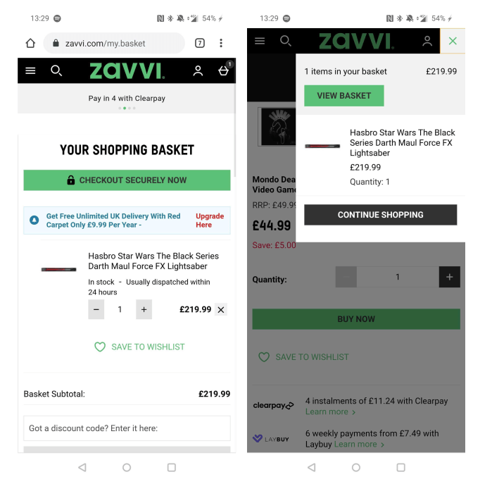
Exhibitor upgrades (throw away project)
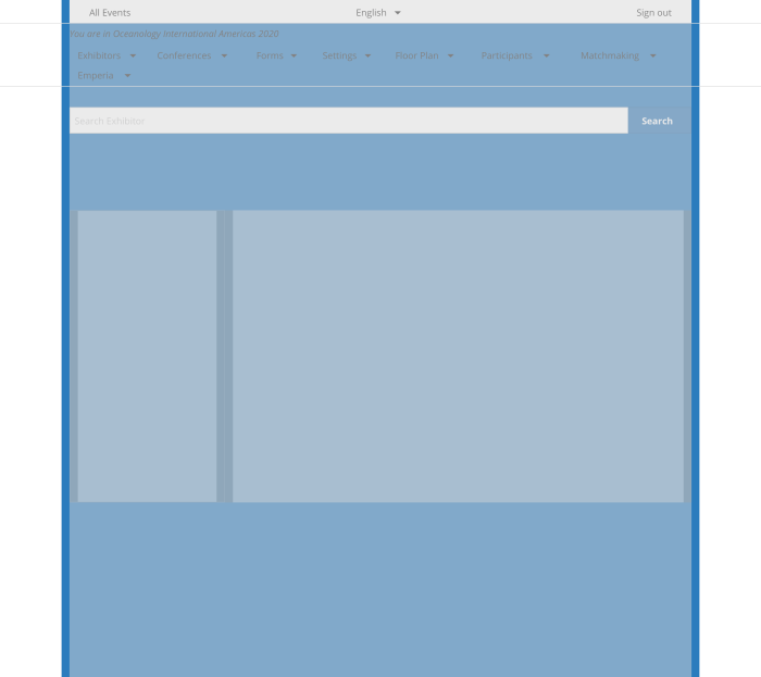
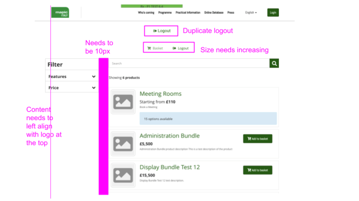
The first part of this project was to help with the UI of what had already been built. Some UX and UI had been communicated before my involvement but what really was needed was a permanent designer.
I was given screen shots and links to the current build, so I had to quickly act to put together designs in order for the work to be completed. Not an ideal start…
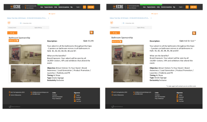
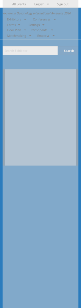
Exhibitor upgrades – initial build
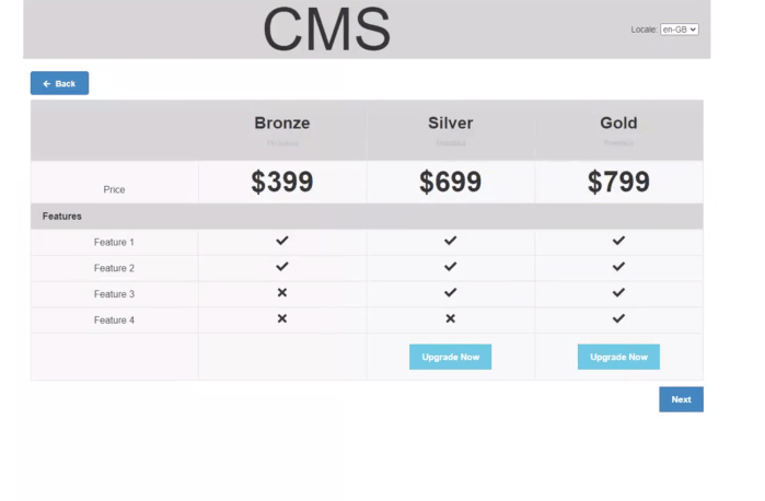
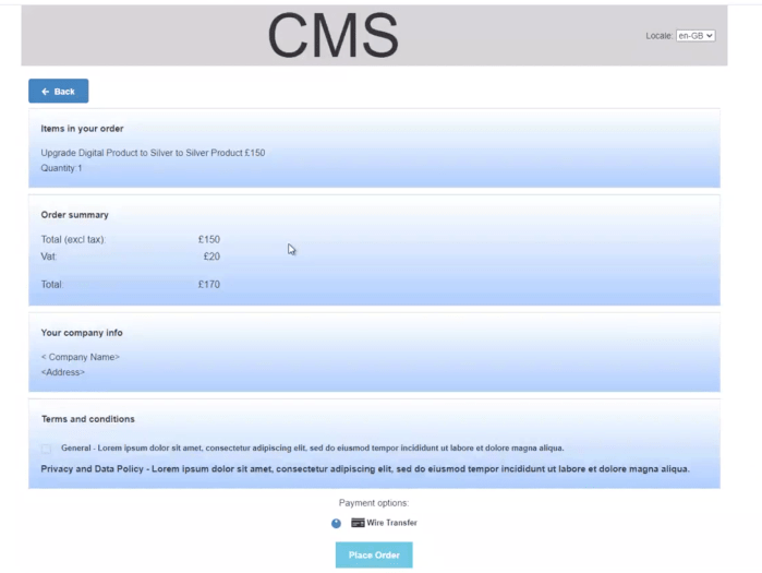
Exhibitor upgrades – design and next build iteration


Benchmarking
When finally having time to take a breath I started to look at popular and different examples of a shop and e-commerce experience. These would help to gather the fundamentals of the project.
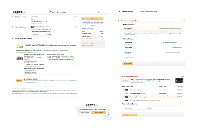
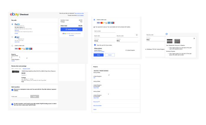

Desk research
I as well scoured the web in search of UX best practice and principles for creating an e-commerce experience. These helped to really gain my own knowledge with what I should be doing, and also focus more on the vision and future experience rather than the tactical solution.
Working with Business Analysts
Work from the BAs had started to put together some mockups on what would be required for a Reed Exhibitions global solution. My initial start was to use this as the guides for creating designs and getting together something more realistic and usable in order to progress the project

Define
User needs
Must haves based on previous research and findings from other companies:
- Descriptive product name
- Recognisable images
- Enlarged view of images
- Price, including any additional product-specific charges
- Clear product options, such as colour and size, and a way to select them
- Product availability
- Clear way to add an item to the cart, and clear feedback when it has been added
- Concise and informative product description
Business needs
Stakeholder interviews provided the following business needs and context:
- Most shows have over 100 products
- Currently under £5K requested to sales rep
- Valuable to generate leads
- Wants to understand who views, buys and add to basket and abandons
- Opportunity for Travel Shows to user VAS
- Brochures currently exist
- US media kit includes tags (user objectives) and show products
- Ability to create a ‘filtered view’ of the shop for targetted email campaigns
- Needs to communicate the products for ‘This will help you achieve X’
- Generally small to medium size companies would use VAS
- Usually spending £500 and at a maximum £20k
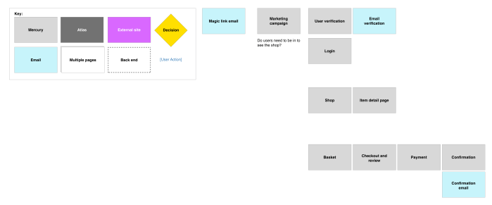
Sitemap
As a starting point, putting a sitemap from workshopping with business analysts to put together a quick straw man of the structure of what the ‘shop’ could be.
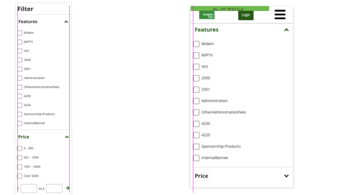
Existing patterns and design
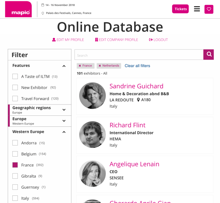
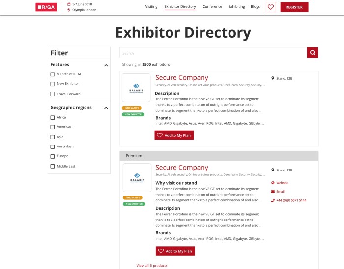
Being part of a larger project the approach was to leverage the existing patterns where possible in order to quickly put something together. Things like filtering, search, directory layouts etc already existed, for the sake of consistency and not being a jarringly different experience the decision was for pace to begin with for consistency, then later it could be more tailored for the user needs.

Layout and structure
Using the Reed Exhibitions four break points as all work is tackled. The main structure is to follow the existing directory patterns for creating an E-commerce experience as a starting point. The structure is designed responsively to cater for filtering, searching, sorting and displaying ‘products’.

Additionally the specifics of the user type and gaining specific feedback was unavailable for the first launch but would be planned to gain user insights post launch.
Principles
Principles put together from looking at online research as well as stakeholder interviews and workshops.
Default and quick
Use the default info for the user to review then complete, rather than have to enter or engage every time
Help to make a decision
Present the most important information and detail enough to understand at a glance, but able to drill down into further detail
Reassure
Step by step and secure
Develop
Header development
One of the main parts of the shop was the basket. As the existing header for the exhibitor area of the site had certain elements that made adding a basket not a straight forward task. As part of this project and another project (see Badges project) the header had to be built specifically for this area.
Collaborating with developers
Working closely with developers and guiding them on pixel perfect build. I would sometimes use pretty quick and throw away feedback docs with Google Sheets. This was a great way at sending feedback quickly and being able to interact with it online, as the developers worked in a different country (as well as lockdown).

Stage environment
During the build process the developers were able to share the builds with me for the build. The video here is a walkthrough of the main functionality of the first release of the shop. This demo is not complete as the header, navigation and basket interaction were not finished being build when this video was recorded.
Deliver
The first release was aimed at getting a shop built as a starting point. This featured:
- Shop page
- Product details page
- Basket
- Filtering
- Searching
- Product enquiry form
- Integrating with the RELX payment gateway
- Confirmation email
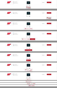
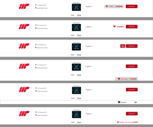
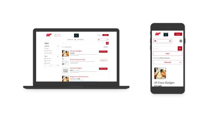
Shop page
The main shop page consisting of products, filtering, search, sorting and a sticky header / basket.
User can add one product, multiple quantities of certain products, and also request cost for more bespoke products via a form.
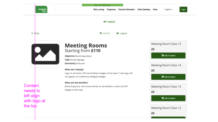
Product detail page
Typical page within E-commerce to have a product detail page with further details about the product and ability to add to basket.

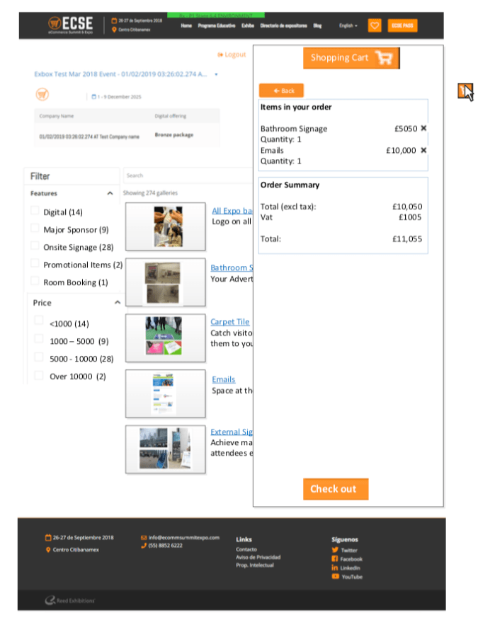
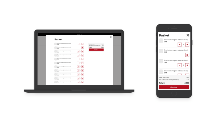
Basket
When clicking on the basket in the header the user can see a breakdown of the different products they have selected. They have the ability to adjust quantities as well as remove. The final cost is very visible and close to the CTA always as this is important for clarity of what will happen within the payments area.
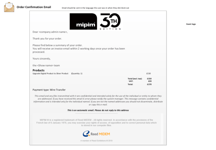
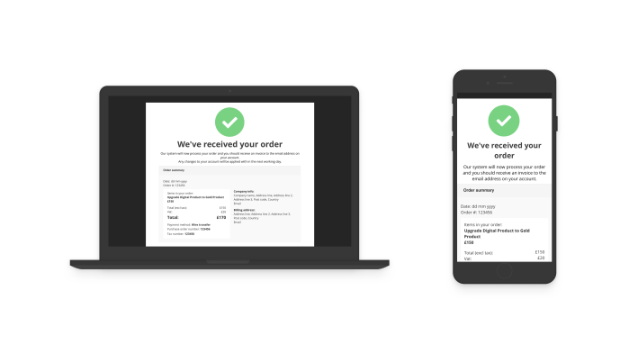
Confirmation email
The payments part of the journey uses RELX payment gateway so I was limited with the UX in that case. In the journey it was important to communicate the user is navigating to a payment gateway which visually would differ from the overall experience. However, I was responsible for designing the confirmation page and email. This acts as clarity of completion and a receipt for the users records.
Future
Testing and user feedback from the pilot show should be the priority for the next build phase. An idea I had would be to also have a ‘feedback’ widget within the shop in order to gain user feedback during usage. Additionally, having a survey present in the confirmation page / email would also be a way of capturing user feedback.
The difficulty testing was accessing specific users before the pilot event. In normal circumstances I would have been able to attend other shows and take a prototype to test with exhibitors from different shows. The panel at Reed Exhibitions at this time had a low amount of Exhibitors. This is growing and in future will be more possible to conduct regular testing with exhibitors.
The next steps of seeing the data, conducting user interviews / testing and surveys would provide the next phase directions as this would give real user behaviour of how someone would navigate and use the shop.
Other Reed Exhibitions projects
