Introduction
Incidents are anything that affects the services that NOW TV provide to their users.
These can be anything from a service is having some minor issues to the entire broadcasting service being down.
The scope of the project initially was to look at the TV service problems as well as system issues i.e.billing not working.
Problem statement
NOW TVs incident management was displayed within their community forum. However, there was a rollout of the NOW TV product in the Republic of Ireland (ROI). ROI does not have a community forum meaning the incidents would need to be shown elsewhere.
The solution of having incidents within the NOW TV site (and later beyond) would then be rolled out across the UK.
Perceived journey
The Reality of the journey
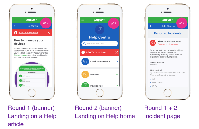
Additionally looking into analytics and data, we discovered that 60% of our users who go into help go via Google, which suggested that the banner on the Help home page was not in the most useful location for our users.

Key user journeys

After exploring the various journeys working with the incident managers, I took the most common issues and mapped out the users journeys. Here I identified pain points and opportunities. The main thing I was trying to uncover here were the areas where displaying an incident would be most relevant, rather than hidden away within an area.
Design studio workshop
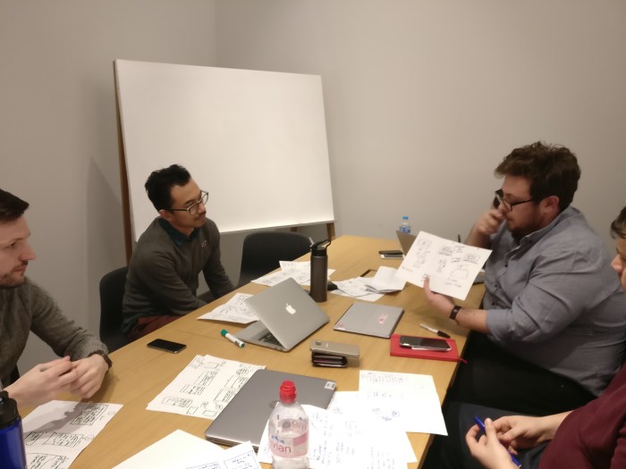
I ran a Design Studio workshop with the Help product owner and the incident managers to come up with some ideas for what they were looking at achieving for successfully solving the problem around communicating incidents to users.
This workshop was one of the most rewarding in my career at that time, as those who attended the workshop were very cynical with what we were doing. However at the end of the workshop I got some very positive feedback such as ‘That was the best meeting I have ever been to”.
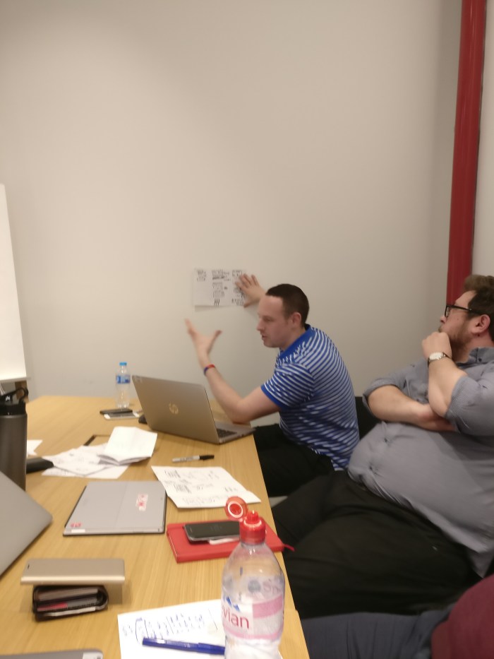
During the workshop we did a ‘bad ideas party’ and ‘crazy 8’ activities. These were designed as ways to collaboratively synergise and align on what we all wanted to achieve. At the end of the workshop we had ways of failure (not useful to the user) and also what would be useful to the user. These then fed into the design principles for the project.
What we don’t want
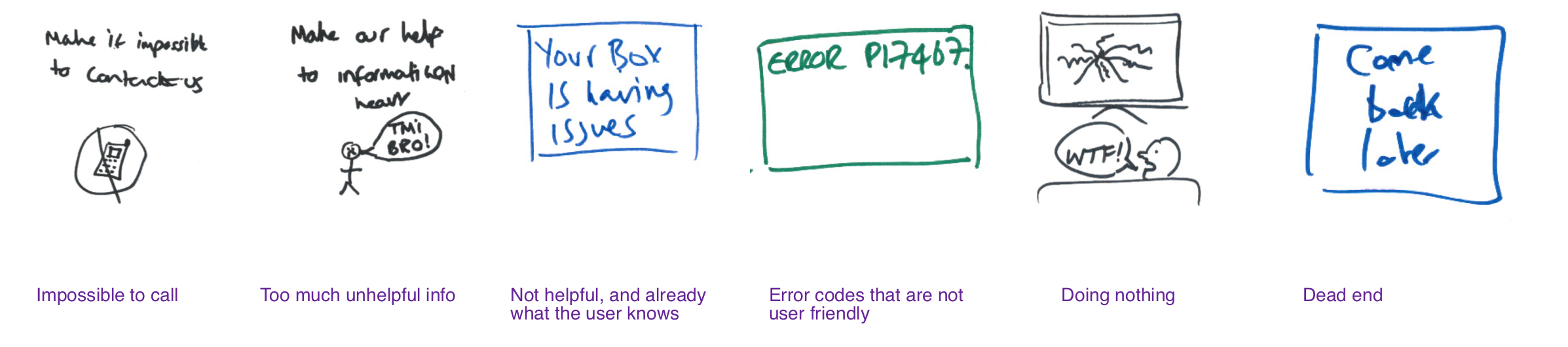
- Impossible to call
- Too much unhelpful info
- Not helpful, and already what the user knows
- Error codes that are not user friendly
- Doing nothing
- Dead end
What we want
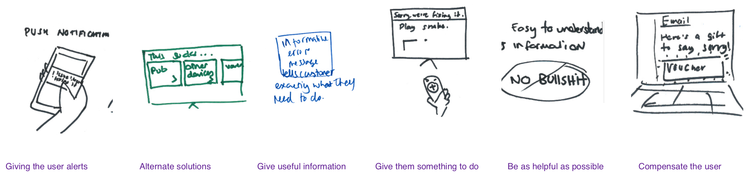
- Giving the user alerts
- Alternative solutions
- Give useful information
- Give them something to do
- Be as helpful as possible
- Compensate the user
Developing design principles
After the workshop I began looking and identifying themes to use as the over riding design principles. I worked with the Incidents Operation Manager and my manager in order to form and agree on these principles which would shape the project going forward.


Design principles
These principles were then added to our presentation (screen shot below) of the areas that I would have to focus on in order to create a user centred solution.
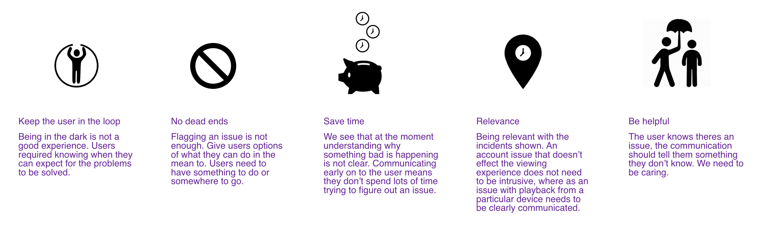
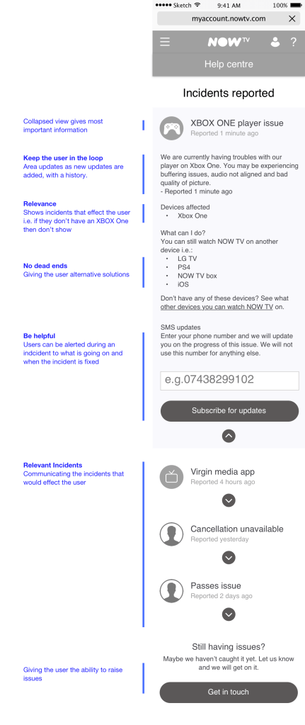
Keep the user in the loop
Being in the dark is not a good experience. Users required knowing when they can expect for the problems to be solved.
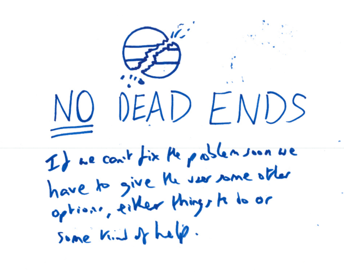
No dead ends
Flagging an issue is not enough. Give users options of what they can do in the mean to. Users need to have something to do or somewhere to go.
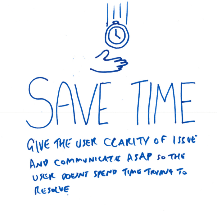
Save time
We see that at the moment understanding why something bad is happening is not clear. Communicating early on to the user means they don’t spend lots of time trying to figure out an issue.
Relevance
Being relevant with the incidents shown. An account issue that doesn’t effect the viewing experience does not need to be intrusive, where as an issue with playback from a particular device needs to be clearly communicated.
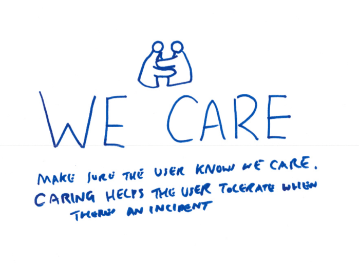
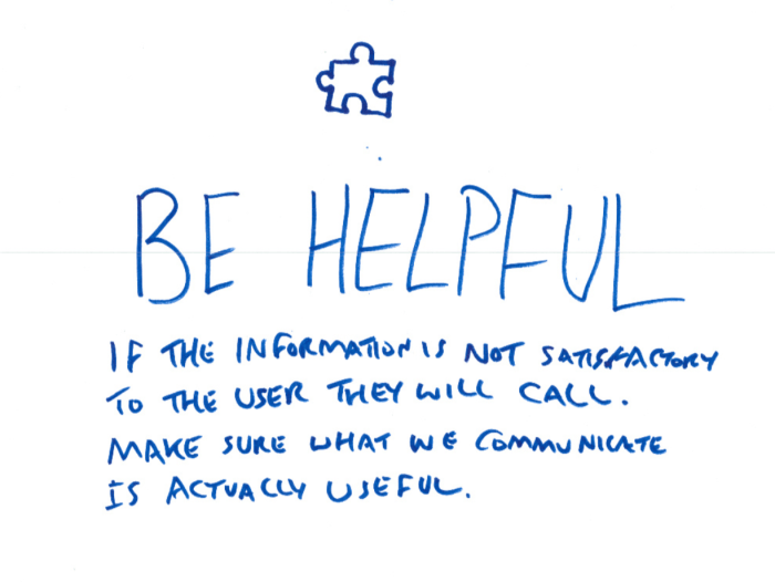
Be helpful
The user knows theres an issue, the communication should tell them something they don’t know. We need to be caring.
Exploring ideas
Once the principles were agreed on and presented it was time to ideate. I began by scamping ideas which I then took the concepts through with the incident mangers, my manager and also the UX team critique meetings.
The types of incidents
The biggest challenge for the project was to understand what were the different types of incidents. There were a variety of different incidents from effecting the users ability to enter a promotional code for a free pass, to a global issue effecting the NOW TV player.
When asking for a list of these to the incident managers, there was not catalogue or list. There were specific variations as well that made it difficult, which meant that a solution would need to be flexible to cater for sure a variety of incidents.
I was given access to Sales force in order to go through the incidents that were raised. These certain incidents also had the live chat transcript which I looked into a few in order to get some qualitative feedback around how the user was affected. I printed the list of incidents out and began to affinity map them into categories, I then digitised the findings.
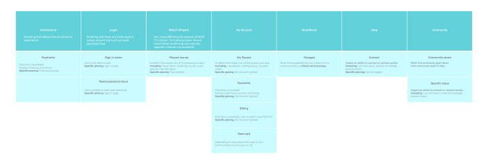
I also looked into different incidents and how they would affect NOW TV as a product and where within the product, as well as looking at the different levels that the incidents would affect.


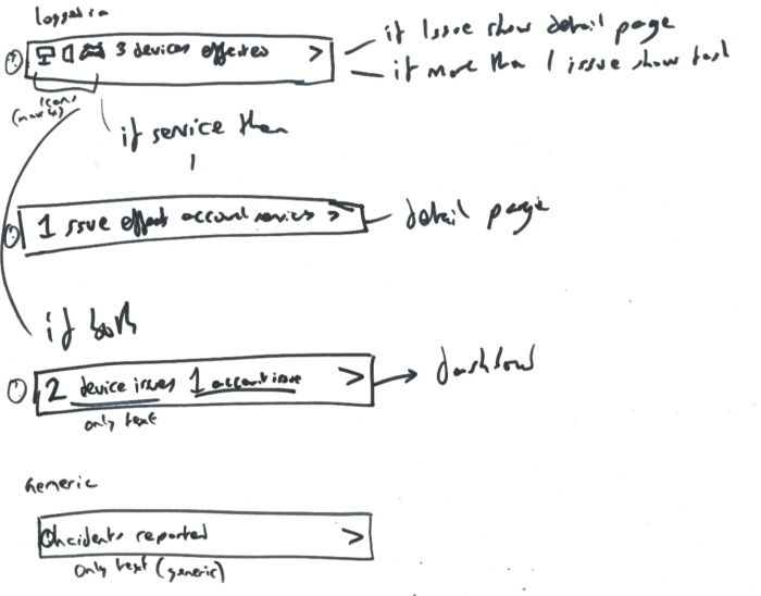
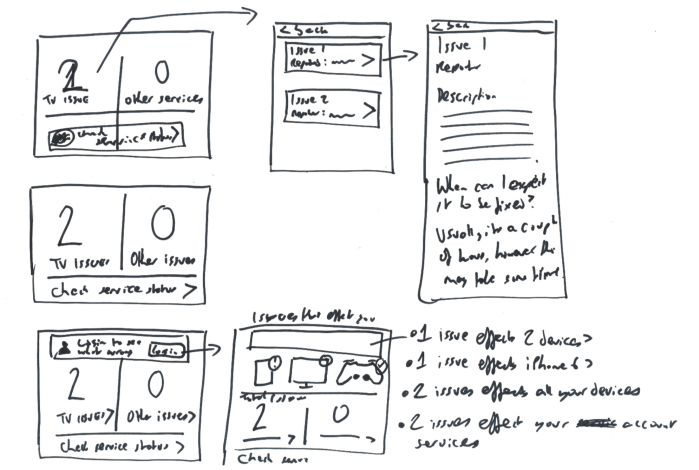
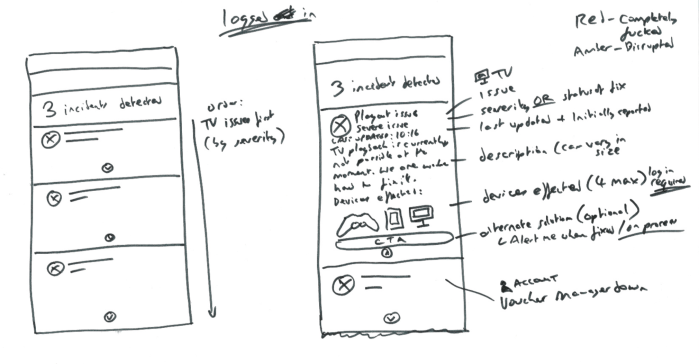
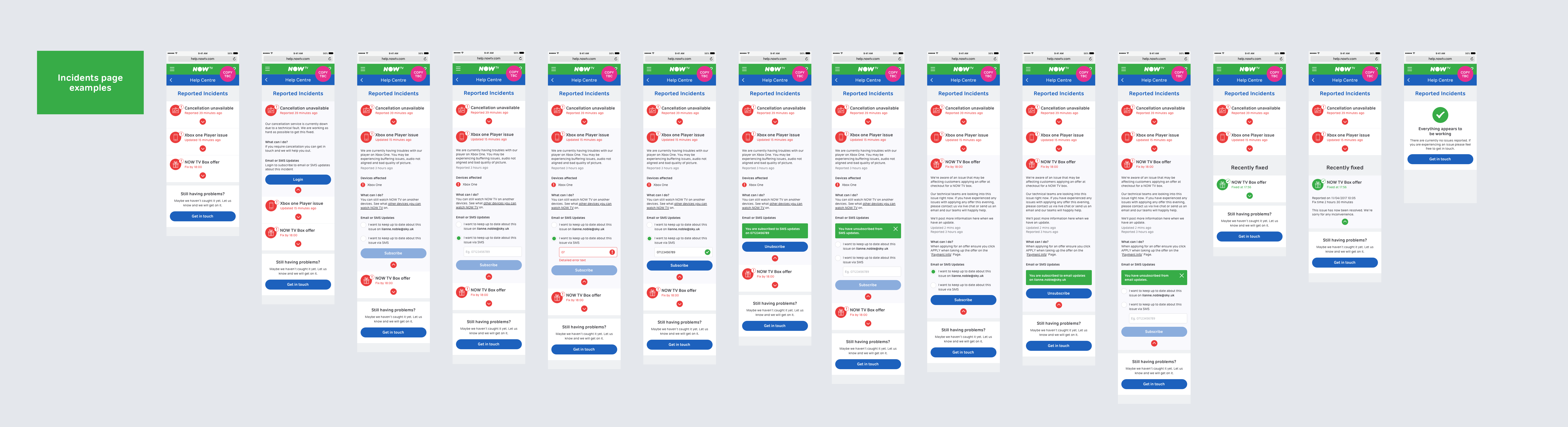
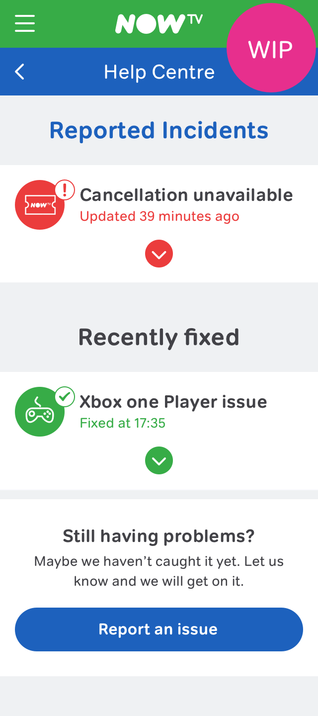
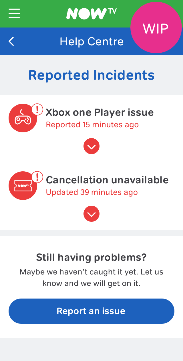
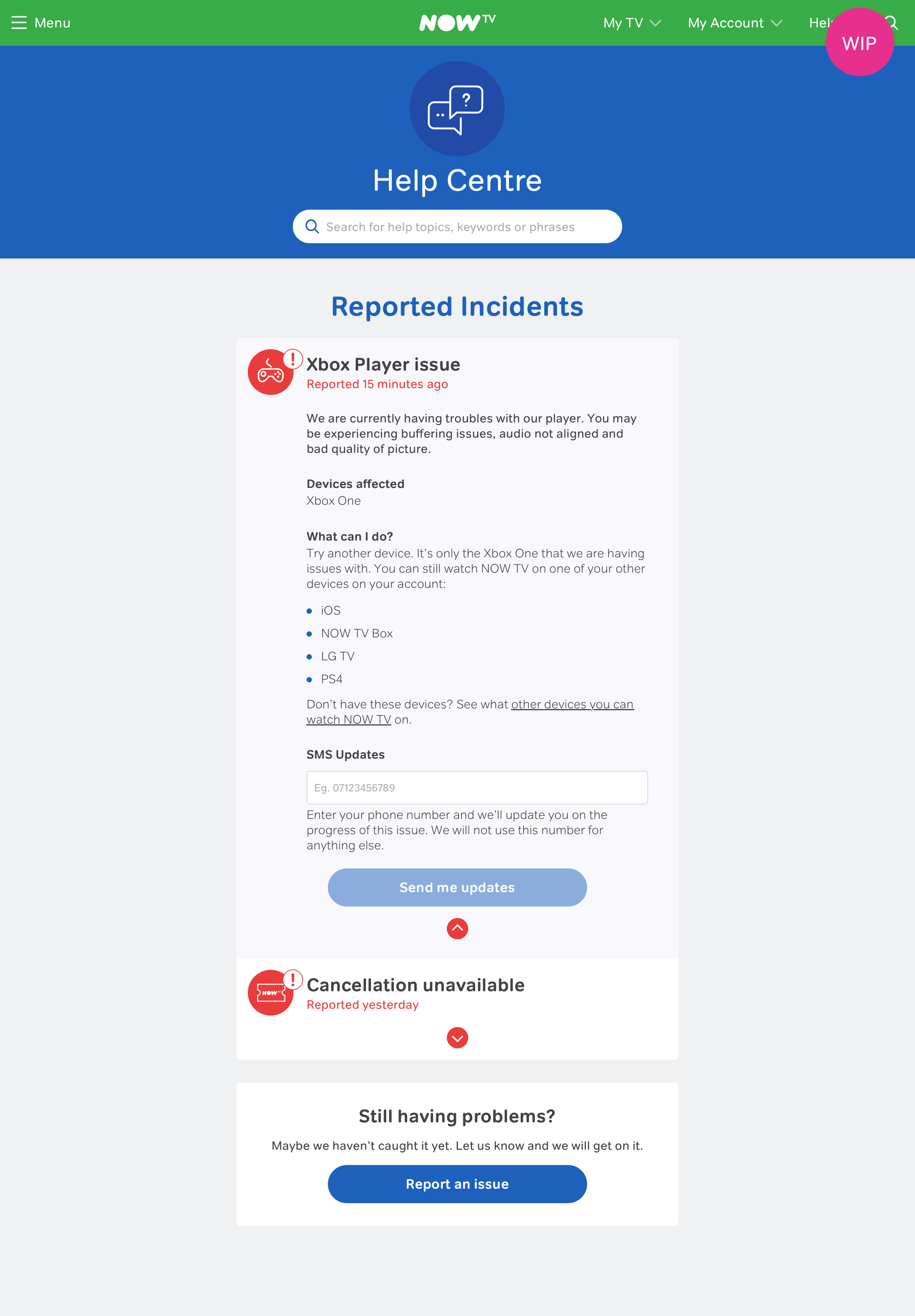
Wire frames
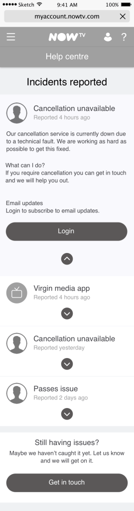
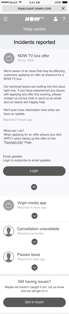
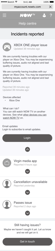
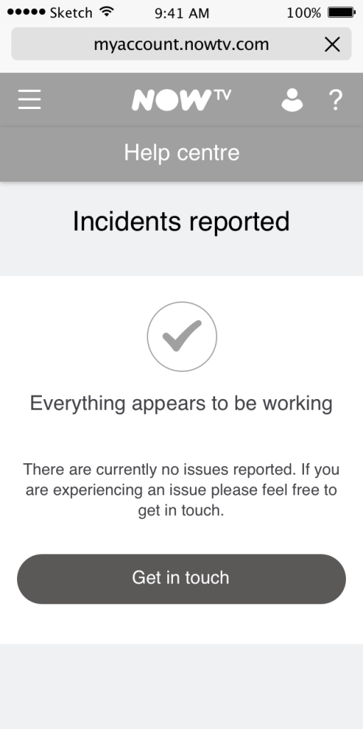
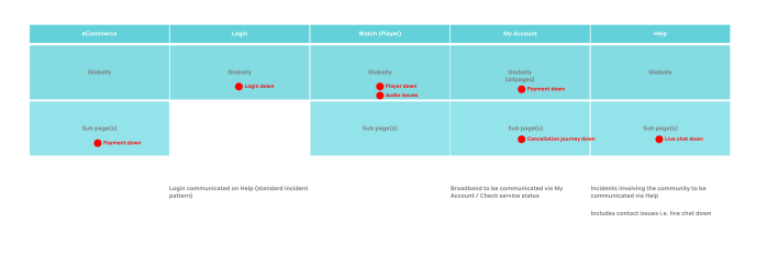
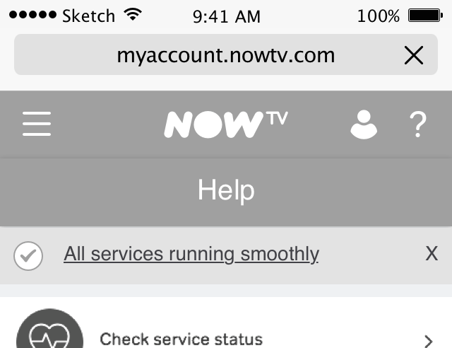
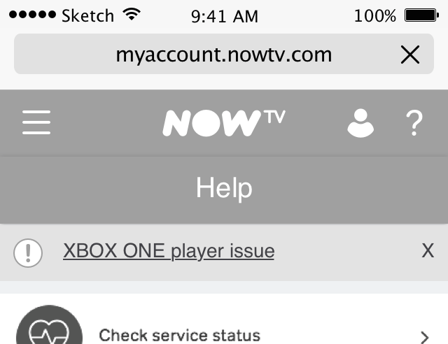
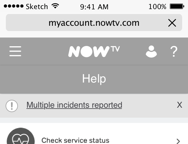
The dynamic banner status that could be placed around our Help site but indicate the specific issues but also provide reassurance when everything was operating as it should be for the user. This would be shown not only on the Help home page but also all other help pages, meaning it would be discoverable if navigating in from organic search to a specific article
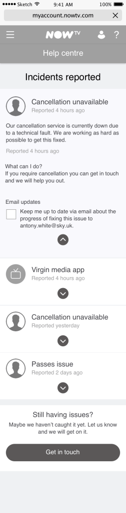
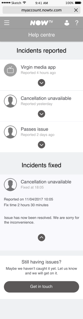
Solution
The main solution followed similar patterns we had within NOW TV. These were accordion based blocks that when collapsed would show the most important information. The accordions were chosen to align with the broad band service status area and additionally due to the amount of incidents that would happen at a time which would be a maximum of three. The interface was built out of the guiding design principles.
UI
I collaborated closely with a UI designer within the design team. We regularly caught up and discussed the specifics and detail to rapidly get the designs aligned to the NOW TV visual design language.

Research
Due to the timing of the project I was only able to do a couple of rounds of guerrilla testing. Additionally we did not have a benchmark from the data to understand the measures of success. It was seen that after MVP was delivered we could then see from the data where users may be having issues to then conduct qualitative testing to understand the ‘why’.
Good:
- Majority understood the issue and they they wouldn’t need to call NOW TV
Bad:
- Banner was hardly seen
- Some people clearly didn’t read due to too much content
From the research it seemed that the banner was difficult for a user to see. Due to the nature of issues the people we tested with were not necessarily in the right frame of mind so it was tricky to be sure if this would be the case. Once again, we believed that for MVP by having a banner built we could then study the data and look at the click rates to understand if this would be useful.
Other NOW TV projects
